
A good architecture portfolio layout does a quiet job. It gets out of the way so the work can speak, and it moves a reviewer from one project to the next without making them hunt for the plan, the section or the point of the scheme.
This guide walks through 15 page layouts taken from real student portfolios published on Issuu, from the cover and contents through to process grids, technical details and the ‘other work’ pages at the back. Each one comes with notes on when to use it and a practical tip. Plenty of the drawings in these portfolios lean on entourage and texture, so if you are building yours now, our free architectural cutouts and free architectural textures are a quick way to lift renders and sections without spending hours on assets.
Before you start: what a portfolio has to do
A reviewer may only spend a few minutes with your portfolio. In that time they want to see three things: how you think, how well you draw and model, and whether you can explain a project clearly. Every layout decision should serve one of those.
Treat the portfolio as a single designed object rather than a folder of old studio boards. Our guide to presentation board layouts covers that format. Expect to re-crop, re-scale and re-order board material before it works in a portfolio.
15 architecture portfolio layout examples
1. The minimal cover
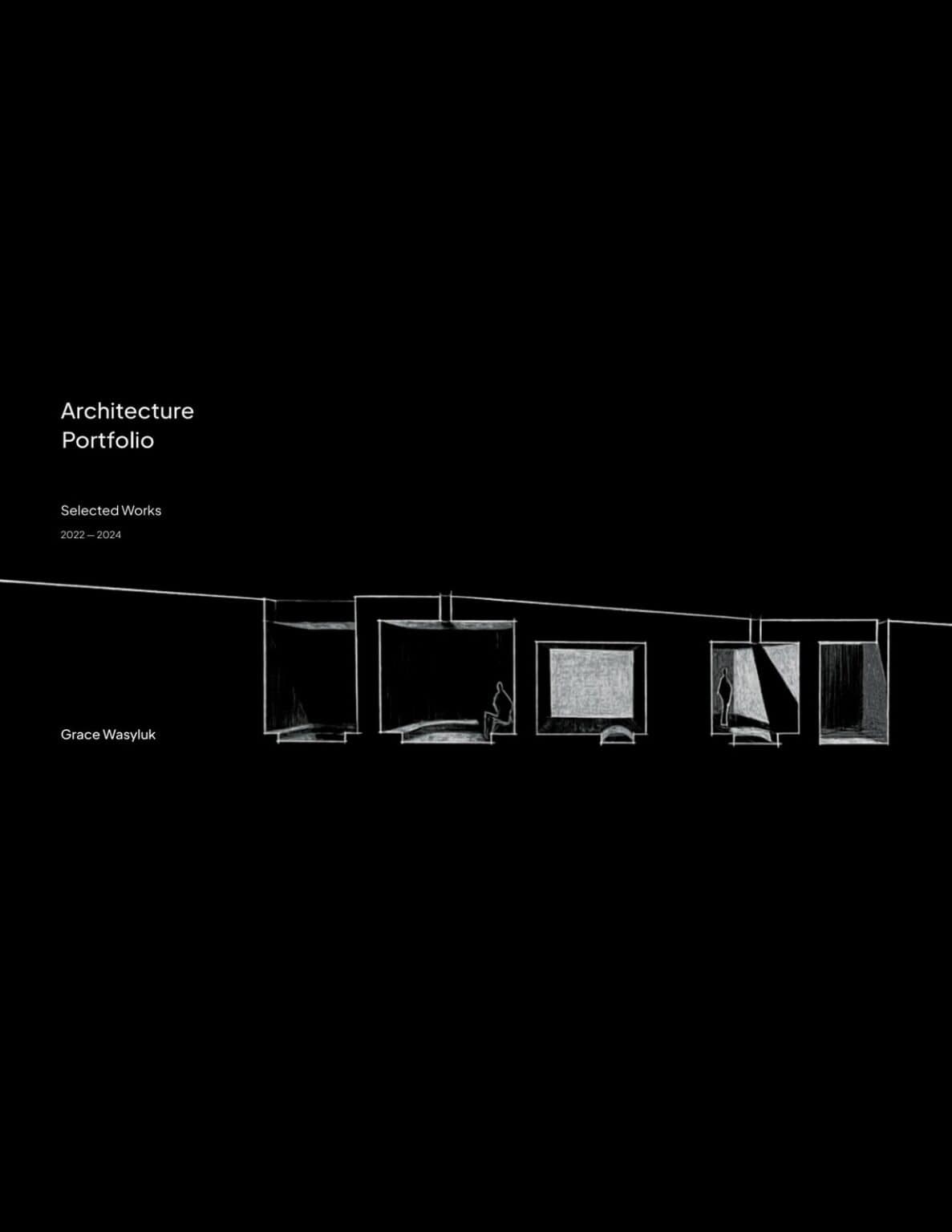
What it is: a cover with your name, a short title and one strong image or drawing, with lots of empty space around them. Grace Wasyluk’s cover uses a black page, small white type and a single hand-drawn section line running across it.
When to use it: almost always. The cover sets the tone, and restraint reads as confidence.
Tip: pick an image that hints at how you work rather than your flashiest render. Check the rules on names, too: Dalhousie wants your name on the first page, while KTH asks for an anonymous portfolio.
2. The thumbnail contents page
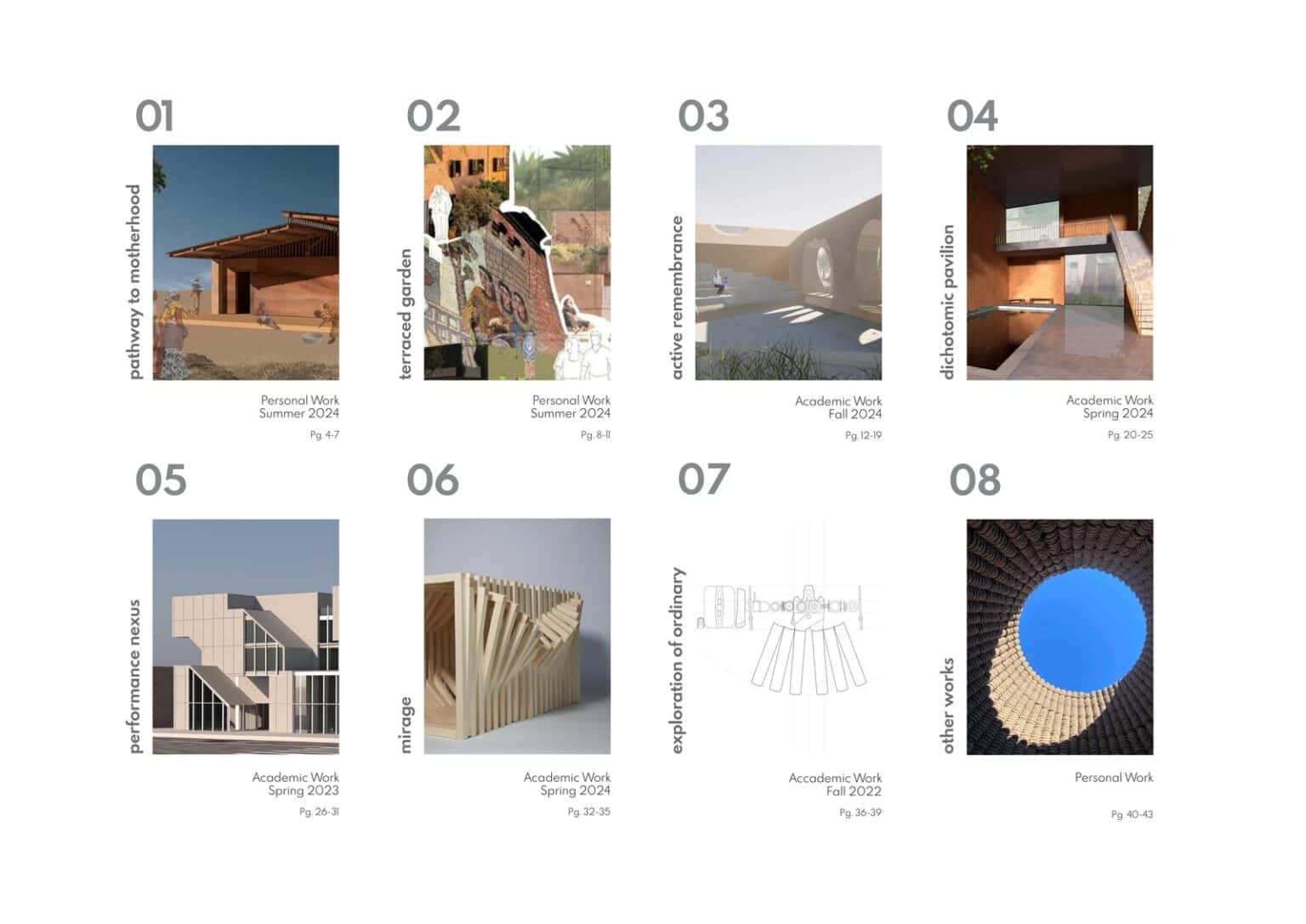
What it is: a contents page in which each project gets a numbered thumbnail, a title, a date and a page range. Maho Kawai’s version adds a label for each project (‘Academic Work’ or ‘Personal Work’), which tells the reviewer straight away what kind of work they are looking at.
When to use it: for portfolios with five or more projects, or when you mix academic, professional and personal work.
Tip: crop every thumbnail to the same proportion and keep the grid strict.
3. The about and CV spread
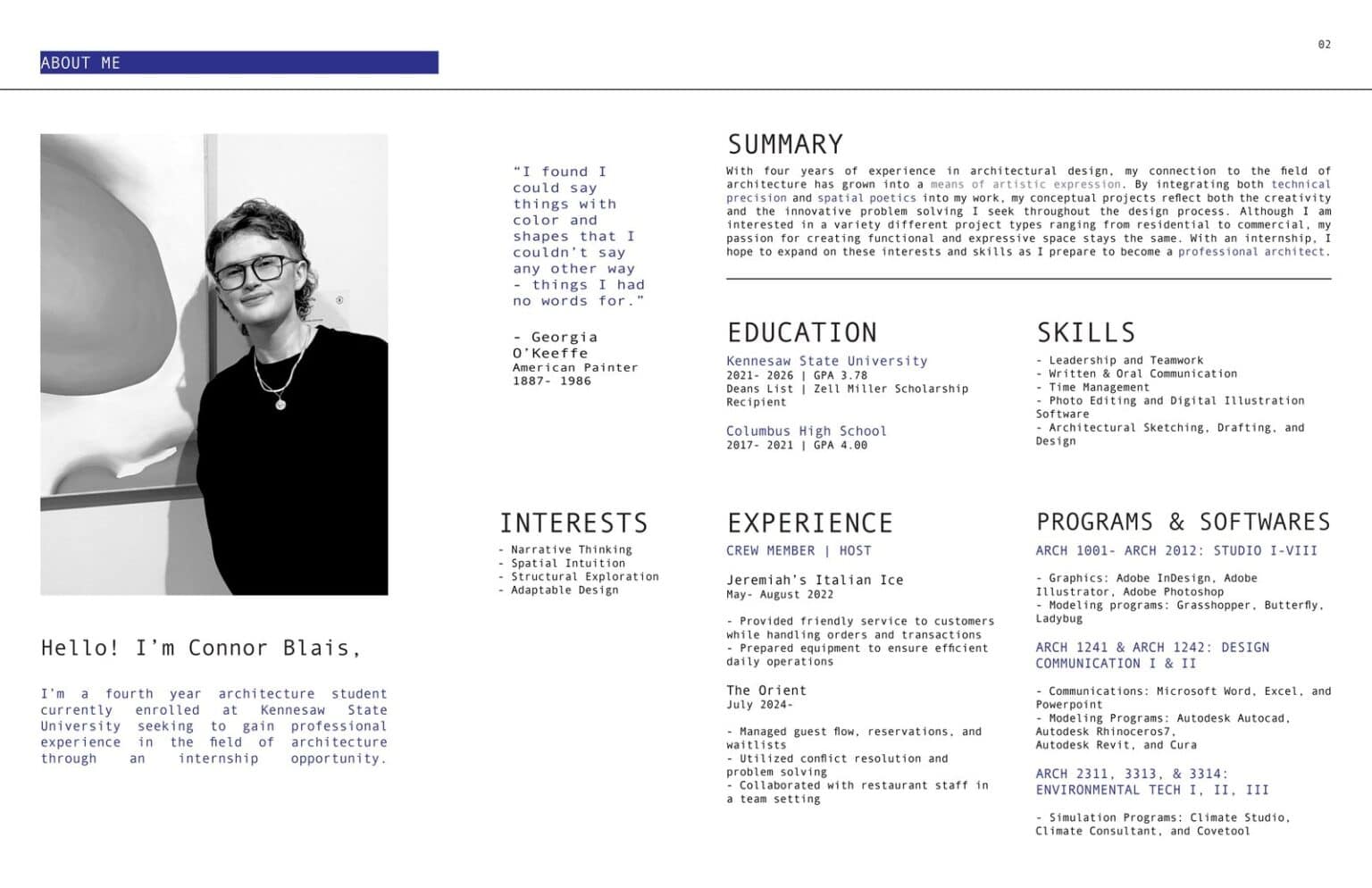
What it is: a short introduction with a portrait, a summary paragraph, education, experience and software skills, set out in columns. Connor Blais uses a blue header bar that reappears across the whole portfolio, so this page already feels part of the system.
When to use it: for job and internship applications, where the portfolio often travels without your CV. Many graduate schools ask for the CV as a separate file, so check before you include one.
Tip: keep it to one spread and list software you actually use well.
4. The full-bleed project opener
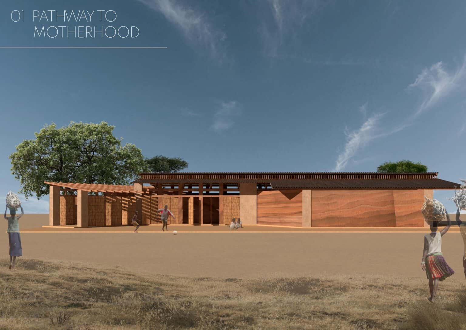
What it is: a single image that runs to every edge of the spread, with the project number and title set straight onto it. Maho Kawai opens ‘Pathway to Motherhood’ this way, with the title sitting in the sky so it never fights with the building.
When to use it: to start your strongest project, or any project with one image that captures the idea.
Tip: use full-bleed openers sparingly, perhaps for two or three projects. Our guide to architectural rendering styles has more on building an image strong enough to carry a whole spread.
5. The white-space opener
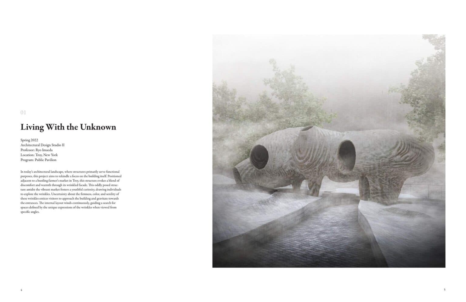
What it is: a quieter opener, with the project title, studio details and a short paragraph on one page and a single image on the other. Jillian Lin leaves most of the left page empty.
When to use it: when the project brief needs a few lines of context before the drawings make sense, or when your image is moody and needs room to breathe.
Tip: list the same facts for every project in the same order, such as year, studio, tutor, location and program.
6. Model photo with project text
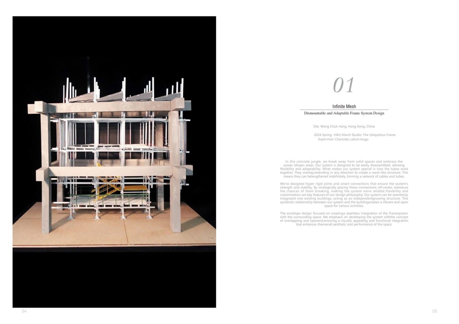
What it is: a physical model photographed against black, filling one page, beside a page of title and description. Jiao Zhongnan’s ‘Infinite Mesh’ spread lets the model do the visual work while the text page sets out the site, studio and design idea.
When to use it: when a physical model is the clearest expression of a project, especially for structural or tectonic studios.
Tip: shoot models against a plain black or white backdrop with one main light source. Keep the text short.
7. One drawing across the spread
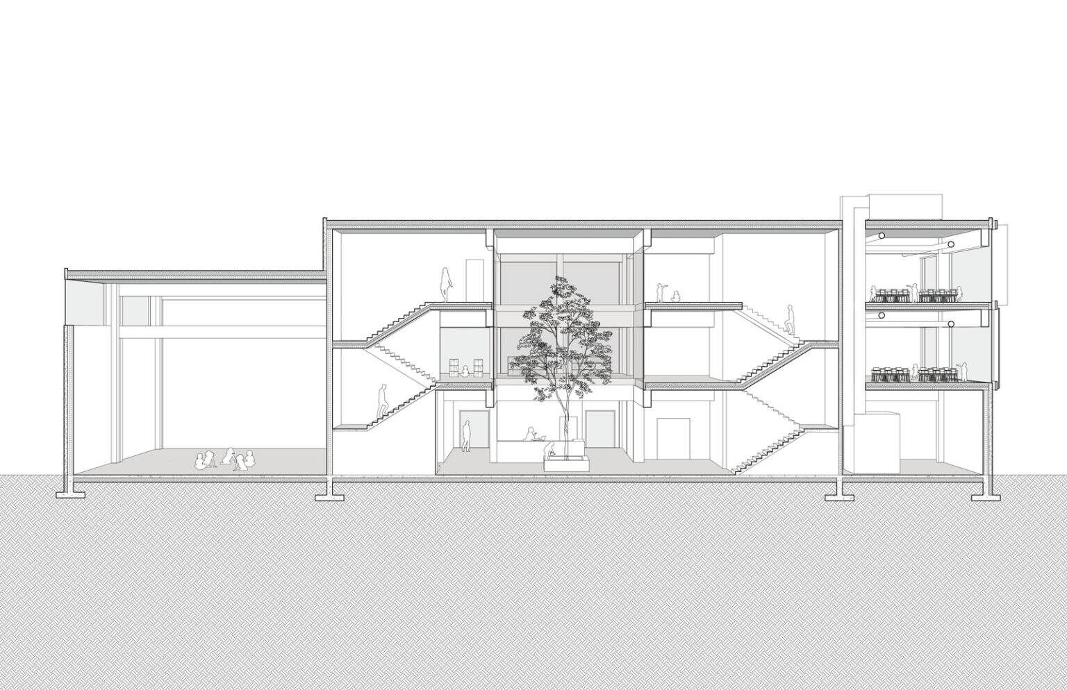
What it is: a single orthographic drawing, here a long building section, scaled up to run across both pages with nothing else around it. The people and the tree give Lizzy Wagner’s section its scale.
When to use it: for long sections, elevations and site plans that lose their detail when they are squeezed onto one page.
Tip: make sure no key element, such as a stair or a figure, lands on the fold. For more ways to draw these, see our guides to section drawing styles and elevation drawing styles. It also helps to study how one well-chosen section explains a building like the Neues Museum.
8. Sectional perspective with a text column
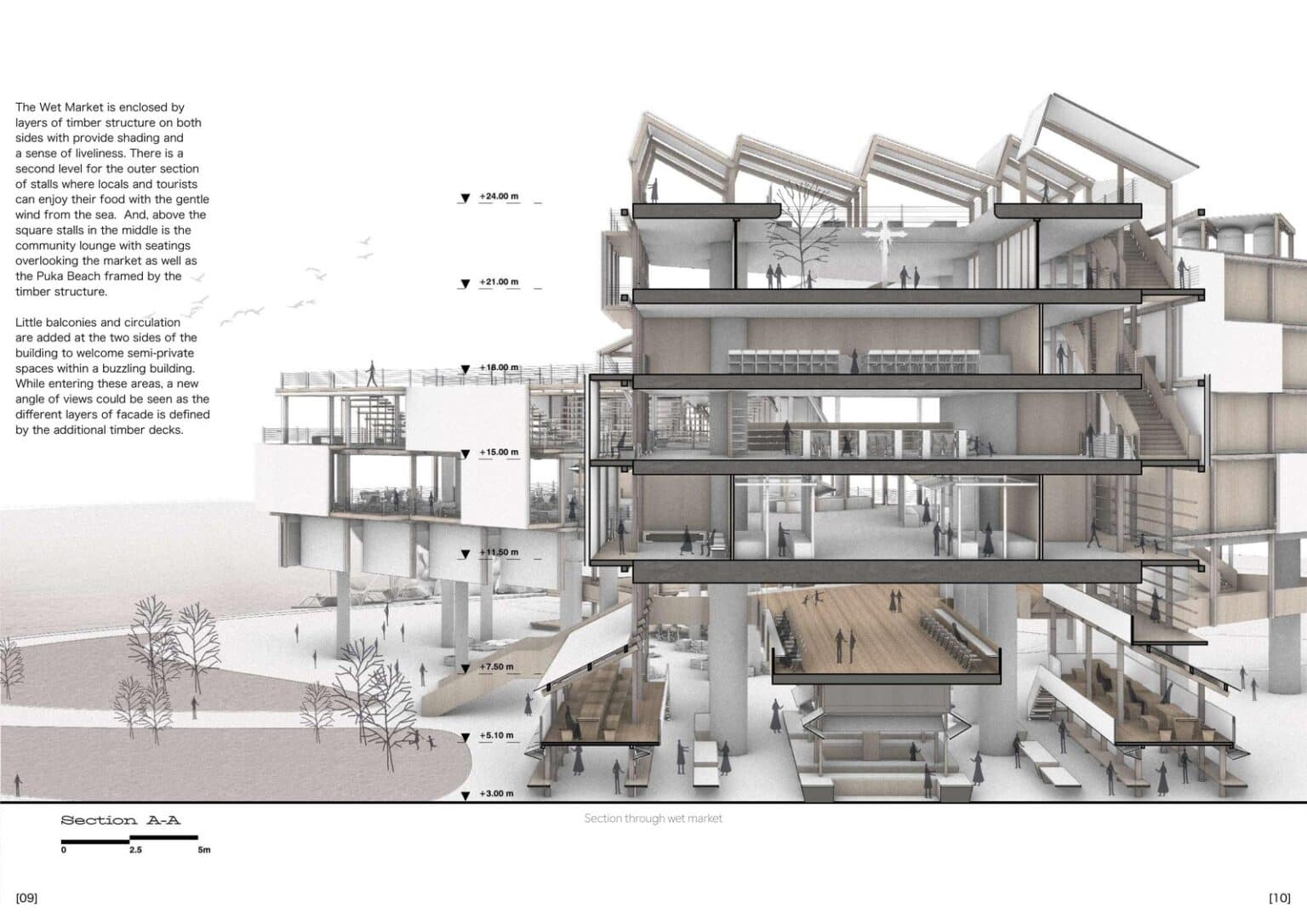
What it is: a sectional perspective that fills most of the spread, with a narrow text column describing what the cut reveals. Jack Lo Ching adds level markers and a scale bar, so the drawing reads as technical as well as atmospheric.
When to use it: for buildings where the vertical relationships are the story, such as markets, libraries and stacked public spaces.
Tip: keep the text column aligned to your grid and no wider than about a quarter of the spread.
9. Exploded axonometric with the drawing set
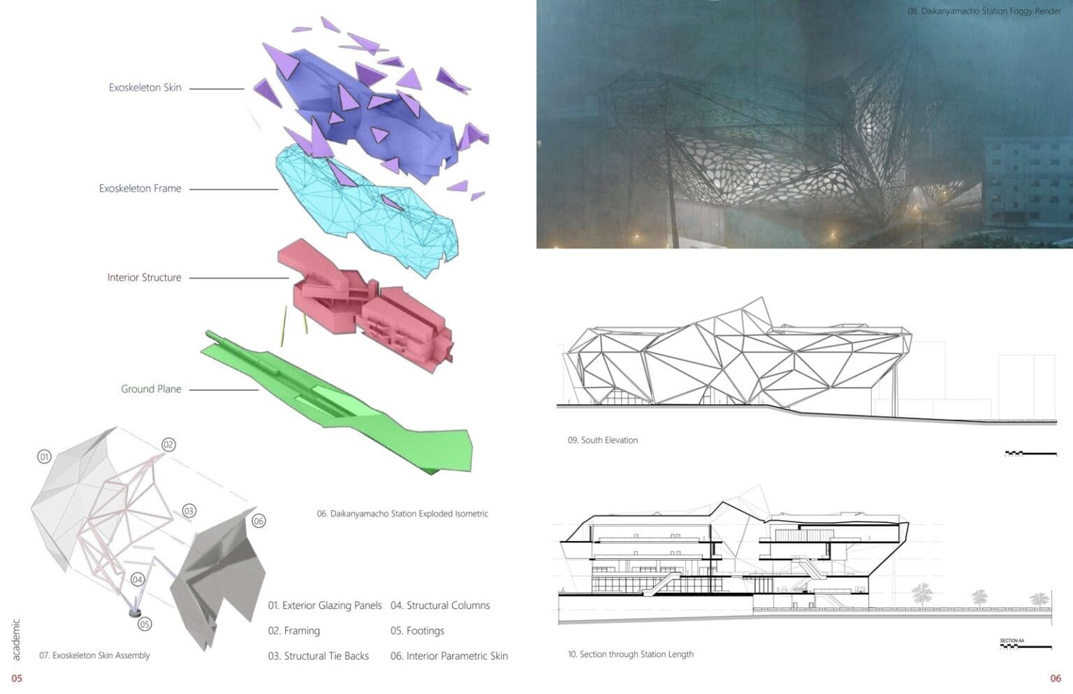
What it is: an exploded axonometric on one page, with a render, elevation and section on the other. Nolan Miranda colour-codes each layer of the station and labels it in plain words.
When to use it: for projects with a clear system, such as a structure, a skin, a kit of parts or a set of layers.
Tip: label layers with short, consistent text and give the drawings on the opposite page the same caption style. Our guide to axonometric drawing styles covers more ways to set these up, and our architectural diagram styles guide helps with the smaller explanatory graphics around them.
10. The process grid
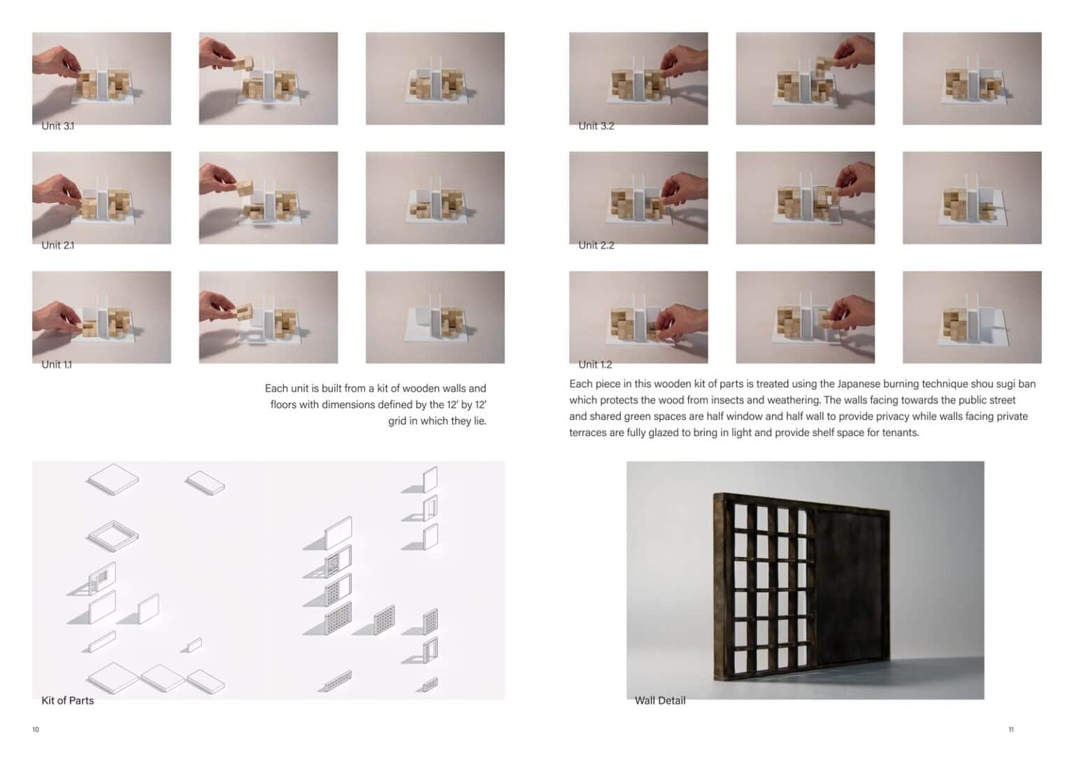
What it is: a grid of small, identical frames showing a design being tested and changed. Richard Pinch photographs hands rearranging timber units for ‘Twelve X Twelve’, then adds a kit-of-parts drawing and a wall model below.
When to use it: when a reviewer needs to see how you got to the answer, not just the answer.
Tip: keep the camera angle, crop and lighting identical across the grid so the only thing that changes is the design.
11. The research grid on a dark ground
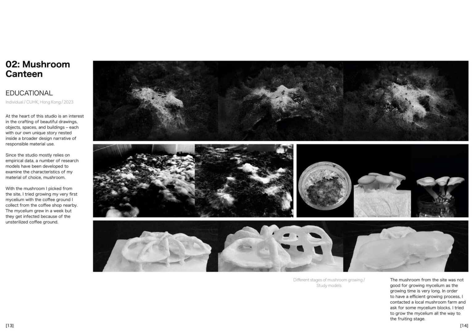
What it is: a tight grid of black and white photos documenting material tests, here mycelium growth and study models for Jack Lo Ching’s ‘Mushroom Canteen’. A text column on the left explains what the experiments were for.
When to use it: for research-led projects, material studies and anything with a hands-on testing phase.
Tip: converting a mixed set of photos to black and white is an easy way to make them sit together.
12. The technical detail page
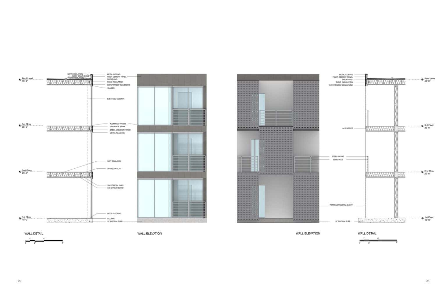
What it is: wall sections and wall elevations laid out side by side with clear annotation and scale bars. Yinchuan Lin mirrors the arrangement across the spread, which makes two facade types easy to compare.
When to use it: for job applications especially. Practices want evidence that you understand how buildings go together, and a clean detail page shows that quickly.
Tip: include at least one technical page even in a design-heavy portfolio. Keep annotation fonts and leader lines consistent.
13. Built work and design-build
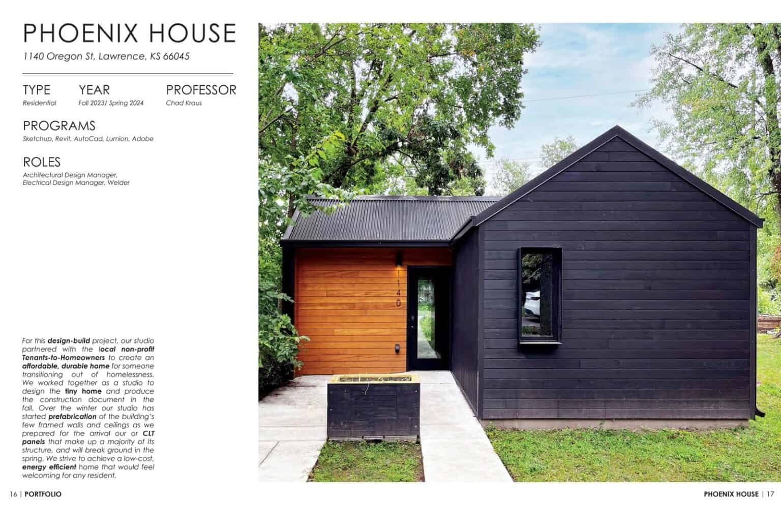
What it is: a photo of something you helped build, with a clear information block listing the project type, year, professor, programs used and your roles. Hayley Ford’s ‘Phoenix House’ spread explains a studio design-build project in a few short lines.
When to use it: whenever you have real built work, from a design-build studio, a pavilion or a practice project.
Tip: state your role plainly. Admissions pages such as Dalhousie ask applicants to describe their role in collaborative projects, and practices care about the same thing.
14. Hand sketches
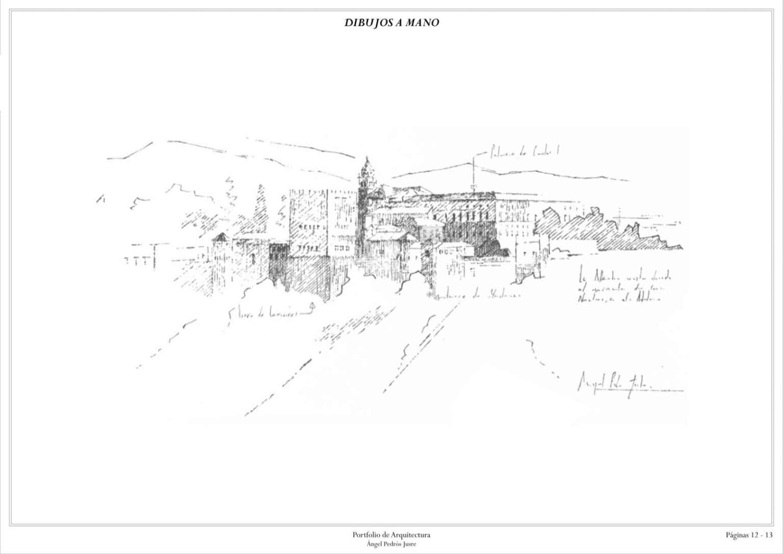
What it is: a page or section given over to freehand drawing. Ángel Pedrós Juste gives his pen sketches a section titled ‘Dibujos a mano’ (hand drawings), framed with plenty of white space.
When to use it: in most portfolios. Some schools ask for hand work outright: Notre Dame currently requires some hand-done graphics in graduate portfolios.
Tip: scan sketches at high resolution and clean up the background so the paper reads as white. Our architectural sketch styles guide has ideas if your sketchbook needs more range.
15. The additional work grid
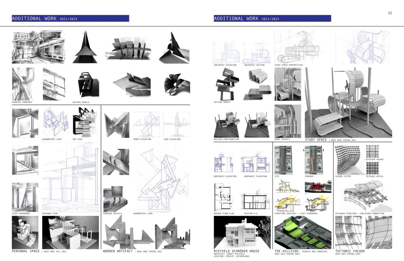
What it is: a closing spread that gathers smaller projects, such as charcoal drawings, gesture models, case studies and short exercises, into labelled blocks. Connor Blais keeps the blue header bar from the start of the portfolio, so even this busy page feels organised.
When to use it: near the end, for work that shows range but does not deserve a full project section.
Tip: group by project, not by medium, and give each group a label with the course and year.
Page size, format and file limits
Most architecture portfolios are set up as landscape A4 or A3 pages, or as spreads of two portrait pages that read as a landscape view on screen. Landscape suits screens, which is how most portfolios are now reviewed. The University of Maryland, for example, says its graduate portfolios are reviewed on screen and recommends landscape orientation.
Always check the application rules before you design anything, because they vary a lot. At the time of writing, KTH in Stockholm caps its master’s portfolio at 15 MB and nine pages plus a cover, and asks for single pages rather than spreads. Dalhousie allows a single PDF up to 20 MB, Notre Dame allows 25 MB and Yale allows up to 40 MB.
- Export to PDF and check the file size early, not the night before the deadline.
- Resize images to the size they will actually appear at before placing them, rather than relying on the PDF export to compress them.
- Keep a print-quality master file and make a lighter version for upload.
Grids and margins
A grid is the single biggest difference between a portfolio that feels designed and one that feels assembled. Set up a simple column grid, such as six or twelve columns on a landscape page, with generous outer margins and a consistent gutter.
Margins should be the same on every page, and the page number and running header should sit in the same place throughout. Several examples above, including the work of Connor Blais and Grace Wasyluk, repeat a header or footer on every spread.
Do not be afraid of empty space. Backgrounds work the same way: plain white or plain black gives drawings room, and paper or concrete textures should stay subtle. Our architectural textures guide covers how to use texture without overwhelming the drawing.
Typography
Pick one typeface, or two at most: one for headings and one for body text. A clean sans serif works almost everywhere. Set body text large enough to read on a laptop screen, and keep line lengths short.
- Use a clear hierarchy of project title, subtitle, data block, body text and caption, and repeat it on every project.
- Keep captions small but consistent, and place them in the same position relative to each image.
- Proofread every word. Spelling mistakes stand out far more in a design document.
Sequencing: what goes first
Put your strongest project first. Reviewers may stop reading early. A common order is strongest project, then a contrasting project showing a different skill, then technical or professional work, with smaller work and sketches at the end.
Aim for range across the sequence: a large public building, a small intervention, a technical project and some hand work. Studying how precedent buildings are presented, from the State Library Victoria to the smaller Maggie’s Leeds Centre, is a useful way to see how different scales call for different kinds of drawing.
Within each project, follow the logic of the design: context and site, idea and diagrams, plans and sections, then renders and details. People and planting help a reader understand scale, and our free architecture cutouts guide shows how to use them so they support a drawing rather than crowd it.
Frequently asked questions
How many pages should an architecture portfolio be?
There is no single answer. Some schools set a page limit (KTH allows nine pages plus a cover), while others set only a file size. For job applications, a short sample portfolio of around 10 to 15 pages, with a longer version ready for interviews, is a common approach.
Should an architecture portfolio be landscape or portrait?
Landscape is the safer default, because most portfolios are now viewed on screens. Portrait pages shown as two-page spreads also work well, as several examples here show, but check whether the school or practice accepts spreads.
Should I include group projects?
Yes, but say clearly that the project was a collaboration, name your teammates and explain which parts you did.
What software is best for a portfolio layout?
Adobe InDesign is widely used because it handles grids, master pages and long documents well, and Affinity Publisher is a popular alternative. Whichever you choose, use master pages and a grid.
Can I include work that isn’t architecture?
Usually, yes. Sketching, photography or furniture can show visual skill. Keep it to a short section near the end unless the application specifically asks for it.
Final thoughts
The best architecture portfolio layouts are consistent rather than clever. Choose a grid, a type system and a few repeatable page types, such as an opener, a drawing spread, a process grid and a technical page, then let the projects fill them. Edit hard and put your best work first.
If you need entourage, materials or inspiration for the drawings themselves, our cutout library and presentation board guide are good next stops.

Recent Posts
Patriot Park Cathedral: How to Read Russia’s Most Militarised Church
Architecture Portfolio Layouts: 15 Real Examples and Tips
Stirling Prize 2026: Lion Green Road Wins, Plus the Full Shortlist