Landscape plan rendering makes a top-down drawing of a garden, park or site read as a place: where the trees stand, which ground is lawn, gravel or water, and how people move through it. The plan stays measured and to scale, but the rendering decides whether a reviewer sees lines or a landscape they can picture walking through.
This guide covers 15 landscape plan rendering styles, each shown with a real plan, from André Le Nôtre’s ink-and-wash sheets to Olmsted Brothers planting plans, a marker concept plan and a digital texture plan for Bilbao. Each comes with notes on producing the look yourself. If you want to try a style tonight, Archtene’s free architectural cutouts include plan-view trees, shrubs and people you can drop straight onto a base drawing.
Landscape plan rendering at a glance
- What it is: adding tone, colour, texture and symbols to a landscape or garden plan so it reads as a designed place
- Core layers: base linework, ground surfaces, planting (trees, shrubs, groundcover), water, shadows, labels and a key
- Hand styles: ink line, pencil, watercolour, gouache, coloured pencil and marker
- Digital styles: flat vector colour, texture-and-pattern plans, CAD or GIS colour plans with a symbol key
- Rule of thumb: decide what the plan has to prove (planting, levels, circulation or atmosphere) and render that hardest
What a good landscape plan rendering does
A building plan is mostly about walls. A landscape plan is about things that grow and overlap: canopies over paths, levels that change without walls, and beds of hundreds of plants that must read as groups.
Get our free architecture cutout pack
Join The Archtene Weekly and we'll send you free PNG cutouts for your boards.
Good landscape plans handle this with a clear hierarchy. Canopy trees are the strongest objects, often with a shadow. Ground surfaces get flat tones or fine textures, water gets an unmistakable colour, and buildings stay simple so the landscape carries the drawing. If you have read our guide to site plans in architecture, think of a landscape plan as the same drawing with the planting and ground plane promoted from background to subject.
15 landscape plan rendering styles
1. Marker and coloured pencil concept plan
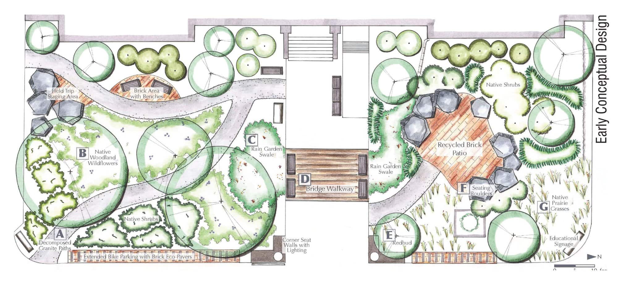
This is the style most landscape students learn first in studio, and it still wins a lot of client meetings. The early concept plans for the Dana Garden at the University of Michigan’s Dana Building show it well: trees drawn as ink circles with a centre point and radiating branch lines, native shrubs as scalloped clumps in two greens, a recycled brick patio in warm orange, and lettered tags (A to G) that tie each area to a short note.
How to do it: Ink the linework first with a waterproof fine pen. Lay a pale marker base, then add a darker green on the shadow side of each canopy. Finish with coloured pencil for texture and a white gel pen for highlights. Keep to four or five colours.
2. Digital texture and pattern plan
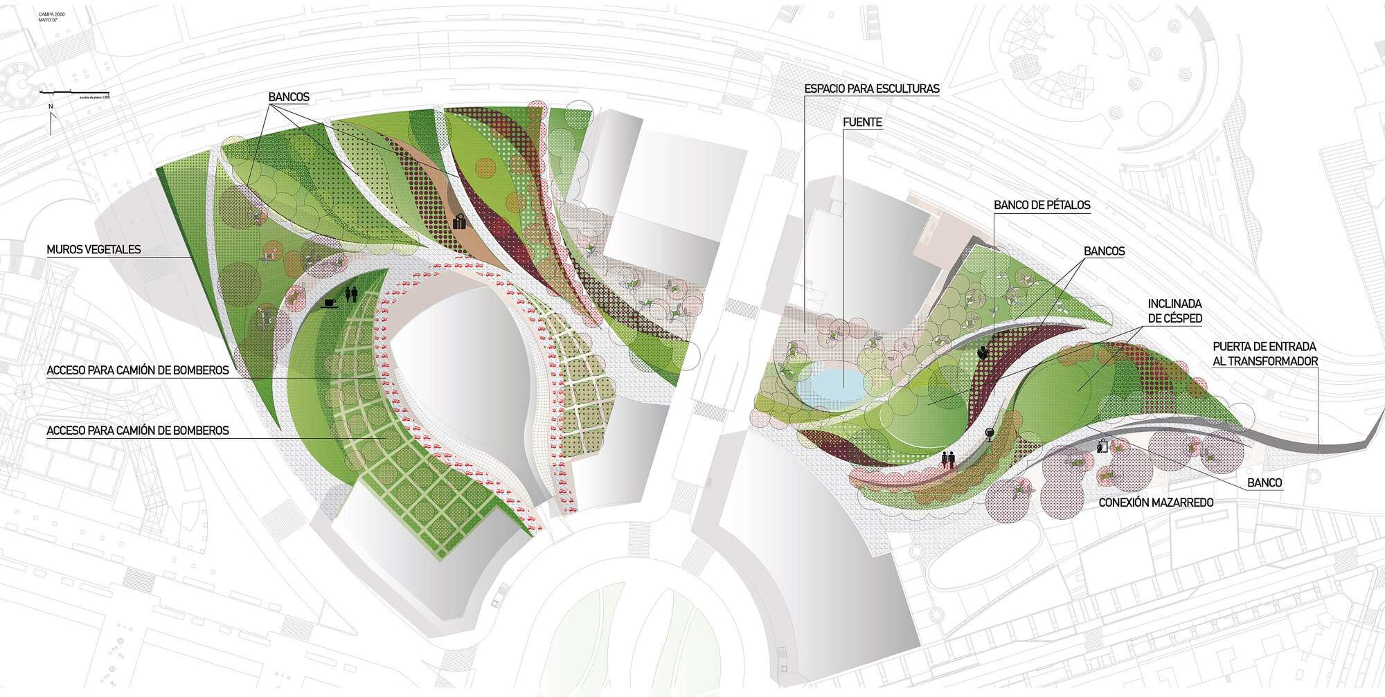
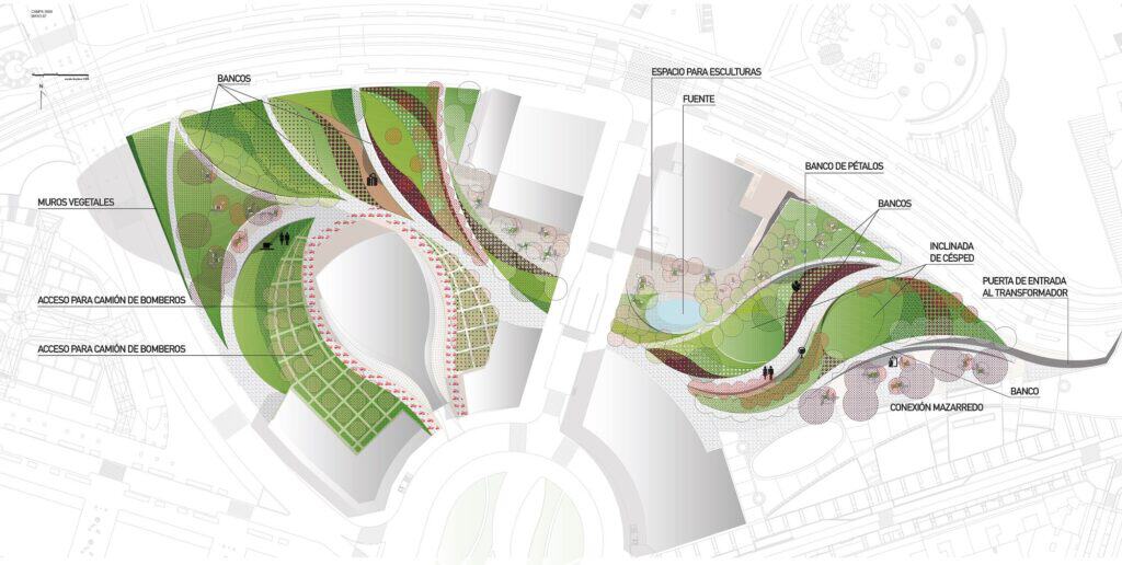
Many contemporary practices render plans in Photoshop or Illustrator with flat colour and repeating patterns rather than realistic textures. This planting plan for a public space in Abandoibarra, Bilbao, drawn in 2007, uses curving bands of green, dotted halftone screens for different planting mixes, pink dotted circles for trees and pale grey context buildings. Callouts mark green walls, fire-truck access, a fountain and benches.
How to do it: Keep each material on its own layer with pattern overlays or clipping masks, so a design change means editing one shape. Set context buildings to 10 to 20 per cent grey and use one font for callouts.
3. Flat vector colour plan
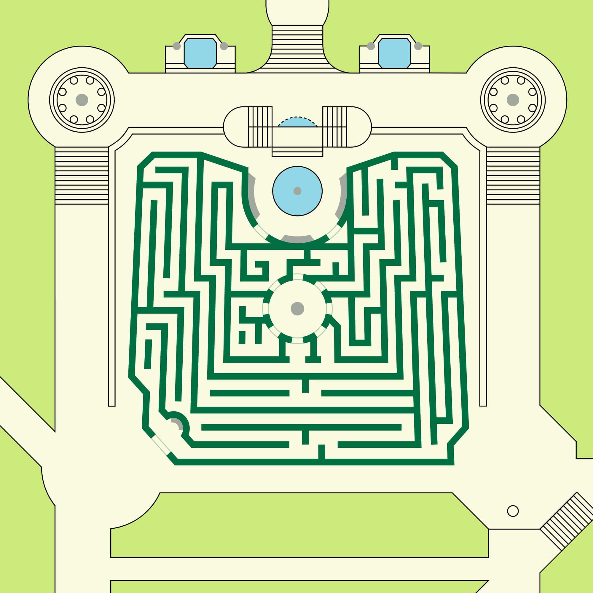
Flat vector plans use solid fills and clean outlines with no texture at all. They reproduce well at any size, which is why they suit diagrams, signage and web graphics. This plan of the cypress maze at the Parc del Laberint d’Horta in Barcelona (laid out from 1791 to a design by Italian architect Domenico Bagutti) shows the hedges as a single dark green stroke, lawns in lime, paths in cream and water in pale blue.
How to do it: Draw in Illustrator, Affinity Designer or Inkscape with a limited palette saved as swatches. Give hedges and walls a heavier stroke than paths, and close every shape: this style shows untidy geometry.
4. CAD or GIS colour plan with a symbol key
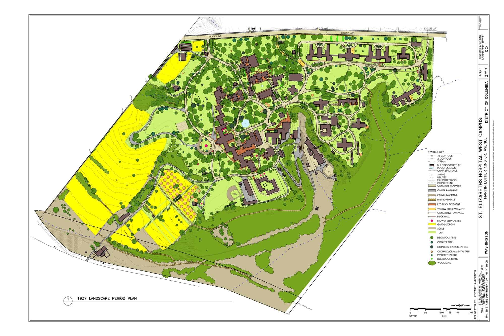
Large sites are often drawn in CAD or GIS and then coloured by layer, with every colour and symbol explained in a key. The Historic American Landscapes Survey (HALS) plans of St Elizabeths Hospital West Campus in Washington, delineated by Heritage Landscapes in 2009, are a good model. This sheet reconstructs the campus in 1937: deciduous and conifer trees as different dot colours, crops in bright yellow, woodland in dark green, and separate hatches for brick, gravel and cinder paving.
How to do it: Build the symbol key first: every fill on the plan must appear in it. Save saturated colours for what the plan is about (here, the 1937 farm fields). The same key used for several dates makes a strong heritage board.
5. Black-and-white line plan with canopy circles
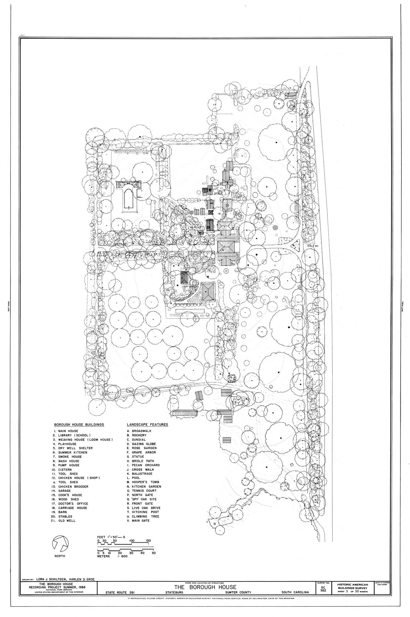
Measured landscape drawings are often pure linework, and they can be beautiful. This HABS sheet for the Borough House in Stateburg, South Carolina, drawn by Lora J. Schiltgen and Harlen D. Groe in 1986, shows every tree as an overlapping canopy circle with a trunk dot, sized to its real spread. Lettered landscape features (rose garden, pecan orchard, live oak drive) are listed in a key beside the plan.
How to do it: Use three line weights: heavy for buildings, medium for canopies, fine for paths and contours. Draw canopies to their surveyed or mature size. A plan like this is the best base for every coloured style here.
6. Planting plan with plant codes
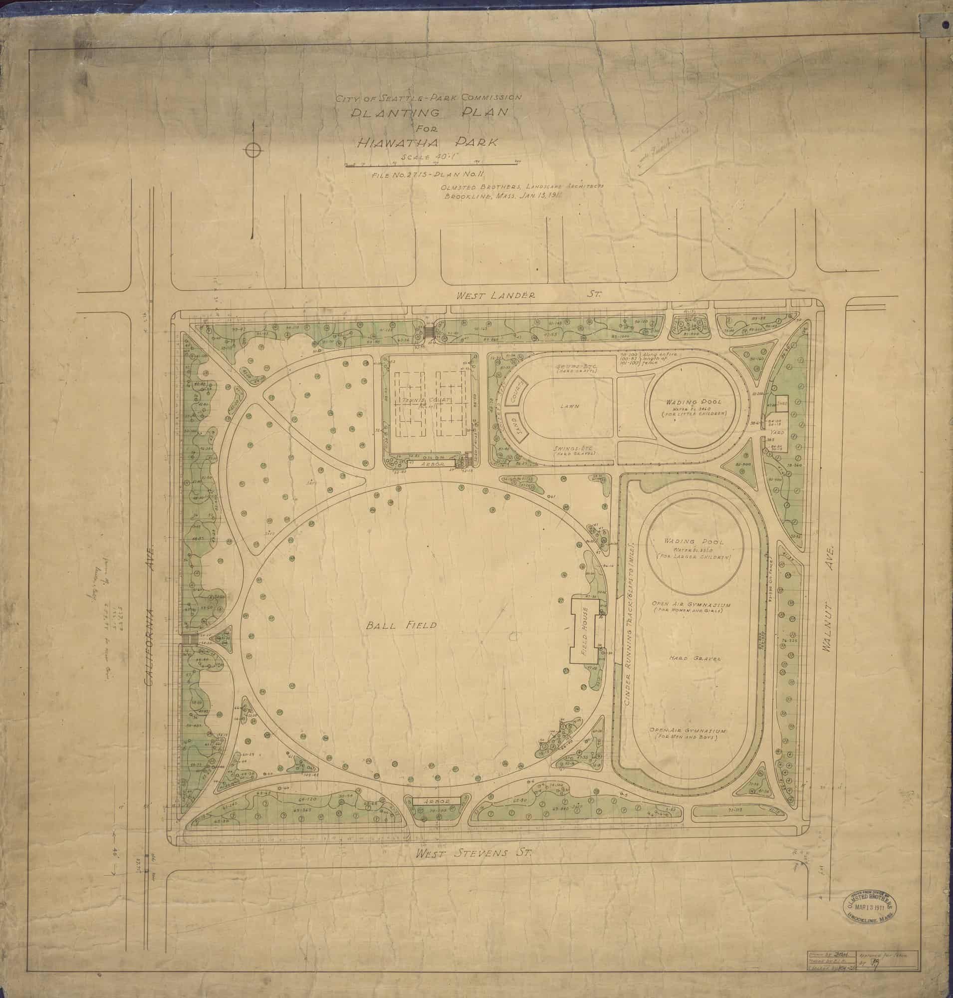
A planting plan is a working drawing: it tells a contractor exactly what goes where. The Olmsted Brothers’ planting plan for Hiawatha Park in West Seattle (13 January 1911) places each tree as a small dot with a code around the ball field and running track, and shades shrub beds in pale green with species codes written along them. A plant list turns codes like these into names and quantities.
How to do it: Give each species a short code. Draw shrubs and groundcover as grouped outlines with the code and count inside. Keep to a single tint so codes stay legible in black and white.

7. Drift border plan with plant names
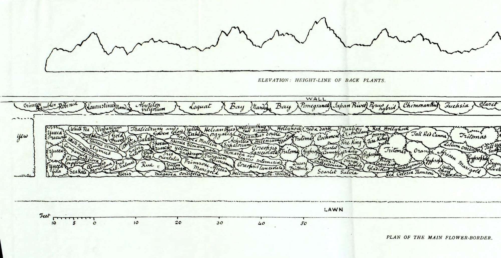
Gertrude Jekyll drew her planting as long, overlapping drifts, each outlined and labelled with the plant’s name in her own hand. This fold-out plan of the main flower border at Munstead Wood, published in Colour in the Flower Garden (1908), runs from yuccas and sea kale at the cool end to red hollyhocks, dahlias and cannas in the hot centre. Above it, a simple elevation line shows the height of the back planting.
How to do it: Draw drifts as long, thin shapes along the border, not blobs, with names written inside. Pairing the plan with a height line, as Jekyll did, explains the planting better than any render.
8. Grading and contour plan
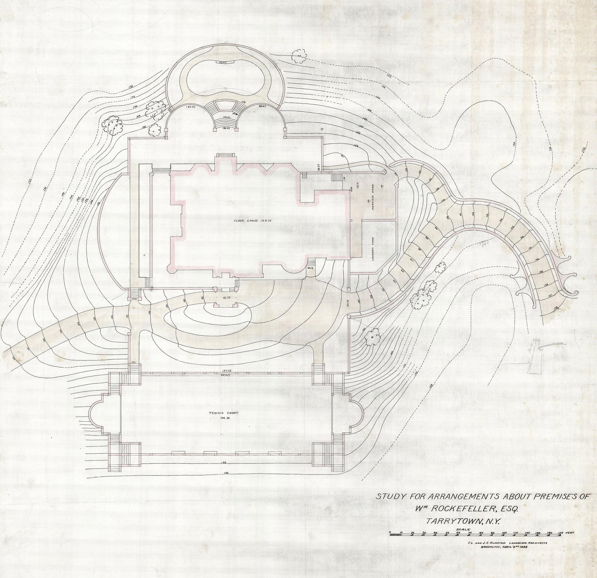
When the design depends on levels, the contours become the main event. This study by F.L. and J.C. Olmsted for William Rockefeller’s estate at Tarrytown, New York (3 April 1888), drawn in graphite and coloured ink on drafting cloth, shows existing and proposed contours flowing around the house, a tennis court and a curved approach drive. Spot levels are written along the drive, and only a few trees are drawn so the landform stays readable.
How to do it: Draw existing contours dashed and proposed contours solid, labelling every fifth line. Tone drives and terraces lightly so flat areas stand out from slopes.
9. Colour-wash canopy plan with legend
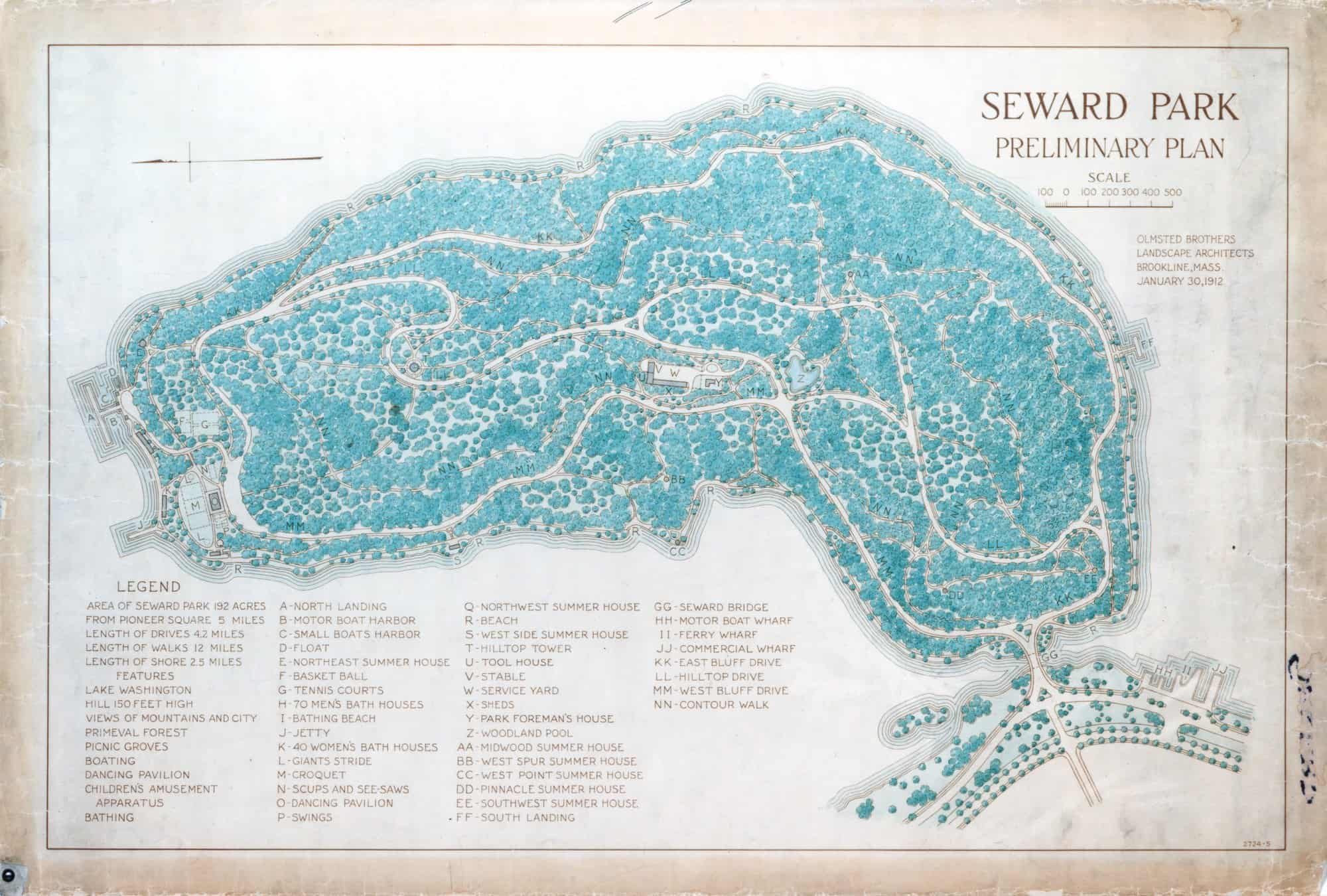
One strong colour for the whole tree canopy can make a large park plan read at a glance. The Olmsted Brothers’ preliminary plan for Seward Park in Seattle (30 January 1912) paints the forested Bailey Peninsula in a single blue-green, with every tree crown dabbed individually. Paths and drives are left as pale lines cut through the colour, and lettered features (A to NN) are listed in a legend below.
How to do it: Pick one canopy colour and vary only its value. Leave paths as negative space, and use a lettered legend when there are dozens of features.
10. Watercolour park plan
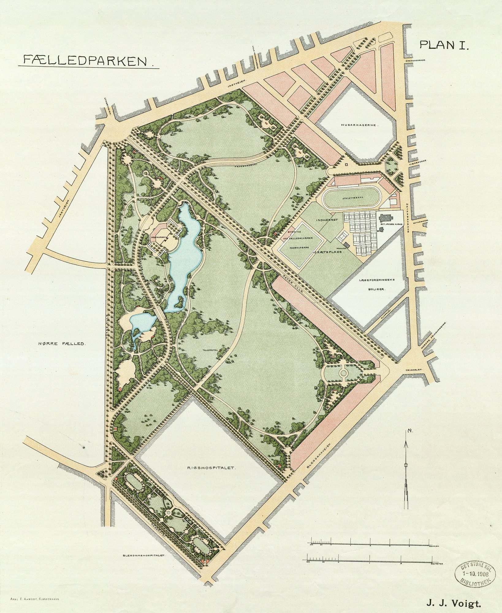
Watercolour plans use transparent washes, so tones layer naturally where trees overlap lawns. The 1908 plan of Fælledparken in Copenhagen, signed by J.J. Voigt and printed as a colour lithograph, uses a sage-green wash for open lawns, a darker green for tree belts, pink for surrounding building plots, blue for the lake and buff for roads. Fælledparken was laid out from 1908 to 1914 by landscape architect Edvard Glæsel and the city engineer’s office, after a competition won by engineers O.K. Nobel and Sven Koch.
How to do it: Mask the paths, then lay the lightest wash (lawn) over the whole site. Add tree belts wet-in-wet so edges soften, and water last in one clean wash. Scan at high resolution for the board.
11. Monochrome lithograph with tree massing
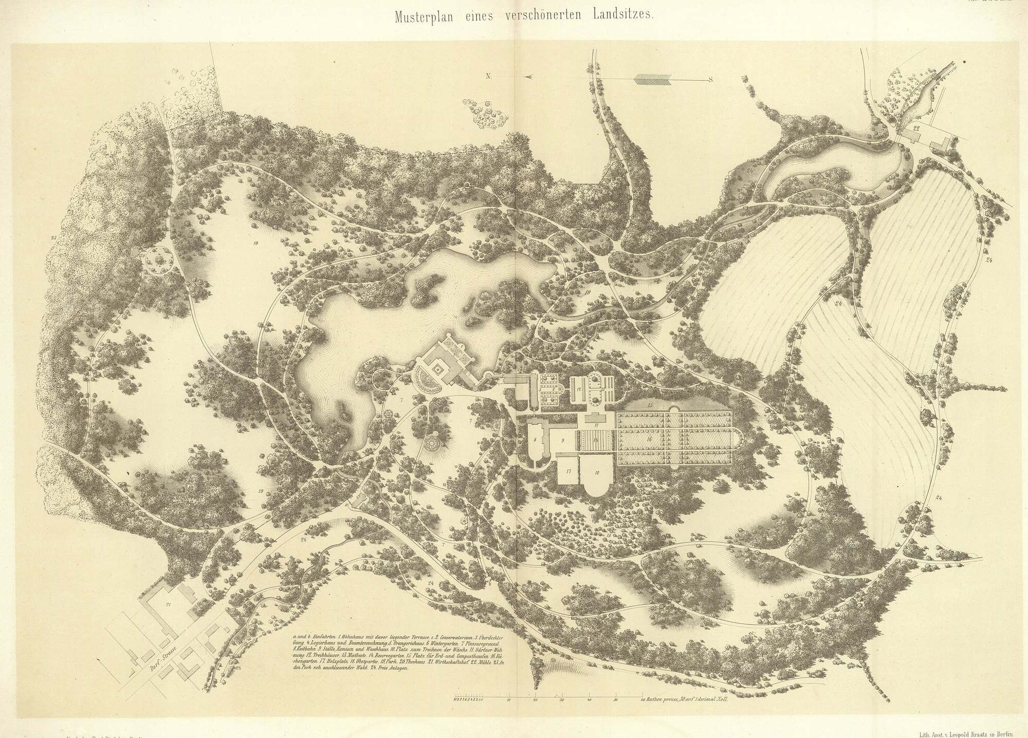
Before colour printing was cheap, landscape plans relied on tone alone. This “model plan of an improved country estate” from Gustav Meyer’s Lehrbuch der schönen Gartenkunst (Berlin, 1860) builds woodland from hundreds of small shaded tree crowns, each shaded on one side, so the plan reads almost like a relief model. Meadows stay blank, ploughed fields are ruled with fine lines, and the house and kitchen gardens sit in the centre.
How to do it: Draw each tree as a circle with a darker crescent on one side, lit from the same direction everywhere. Cluster crowns at woodland edges and thin them into the meadow. In Photoshop, plan-view tree cutouts with a consistent drop shadow do the same job.
12. Ink and wash formal garden plan
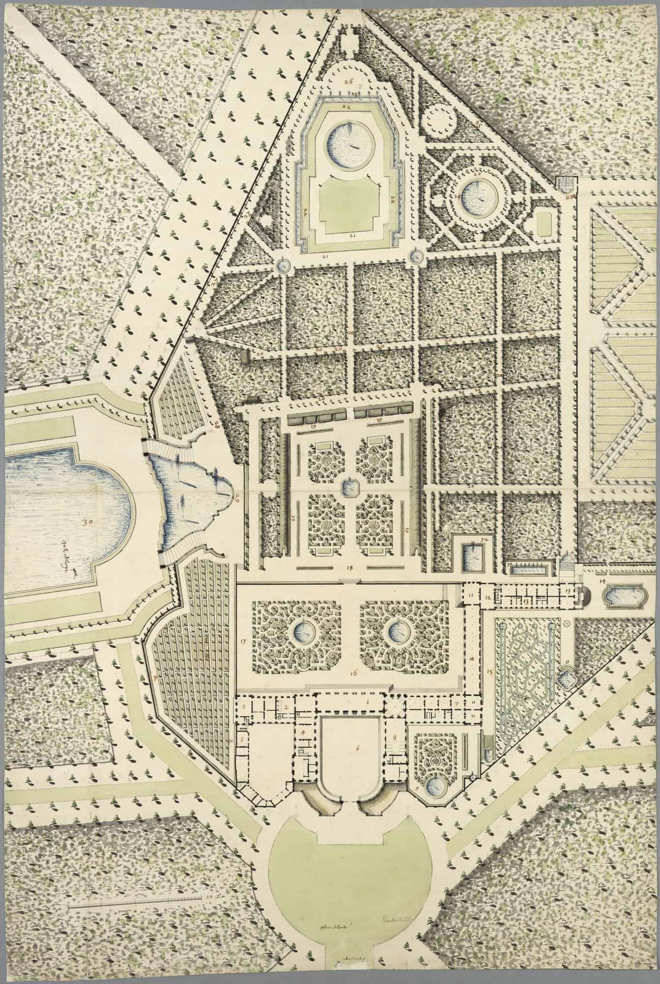
Seventeenth-century French garden plans are a lesson in pattern. This plan of the Grand Trianon at Versailles with its gardens, attributed to André Le Nôtre and dated 1694, uses grey ink for clipped bosquets, delicate scrolls for the parterres, pale green wash for lawns and blue for basins. Numbers keyed to a written memorandum identify each part.
How to do it: Set out the geometry in pencil, ink it, then wash in two or three values of one grey-green. Draw patterned parterres once and mirror them, by hand or with Illustrator pattern swatches.
13. Plan with perspective vignettes
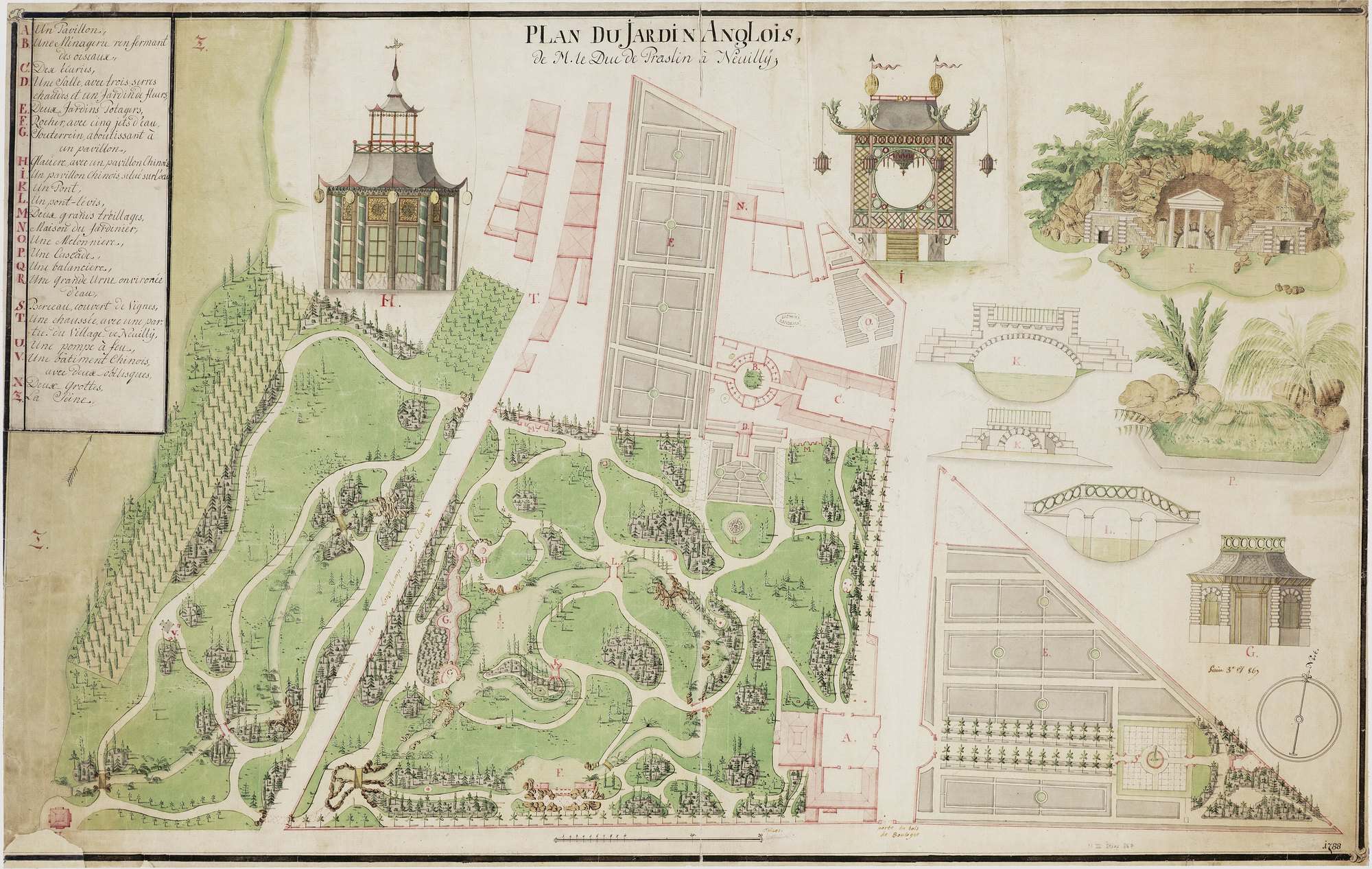
Some plans add small views around the edge to show what the plan cannot. This 1788 plan of the English-style garden at Neuilly, laid out from 1777 for the financier Claude Baudard de Saint-James and owned from 1787 by the Duc de Praslin, surrounds the watercolour plan with elevations of a Chinese pavilion, a grotto, bridges and garden buildings, each lettered to its position.
How to do it: Keep the plan largest and the vignettes small, in the same palette, each lettered to its spot. On a modern board, small perspective sketches play the same role.
14. Gouache graphic plan
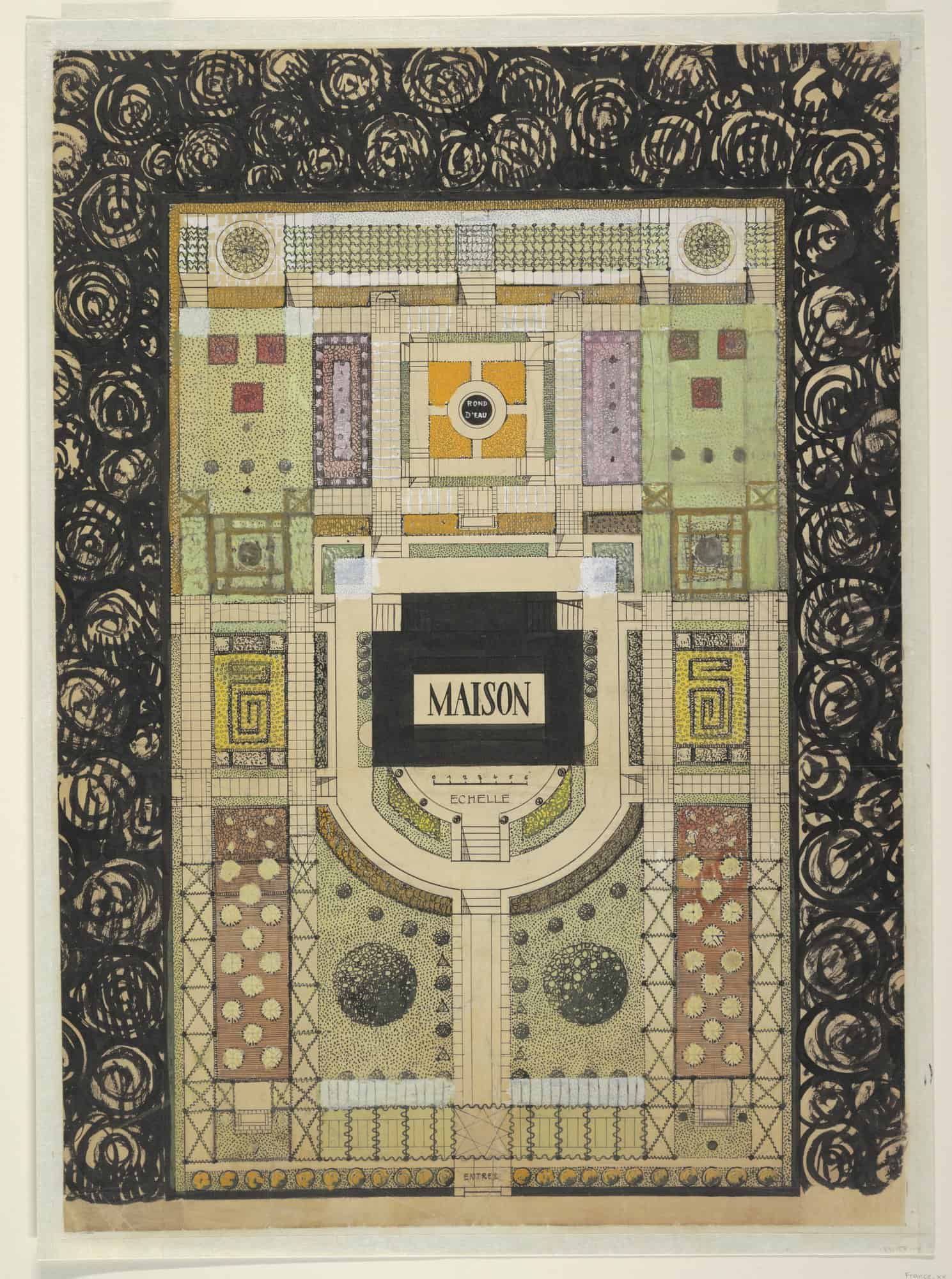
Gouache is opaque, so it gives flat, saturated colour that suits decorative and conceptual plans. This ground plan for a house and formal garden, the “Jardin d’Amour” (about 1914, in the Cooper Hewitt collection), frames the garden with a black border of swirling trees and renders each bed in a different colour and pattern: yellow spirals, mauve panels, dotted lawns and two dark round trees.
How to do it: Treat each bed as a flat shape with one colour and one pattern, and use a dark frame to make light colours glow. Flat fills and pattern brushes give the same look digitally.
15. Plan-oblique and axonometric landscape plan
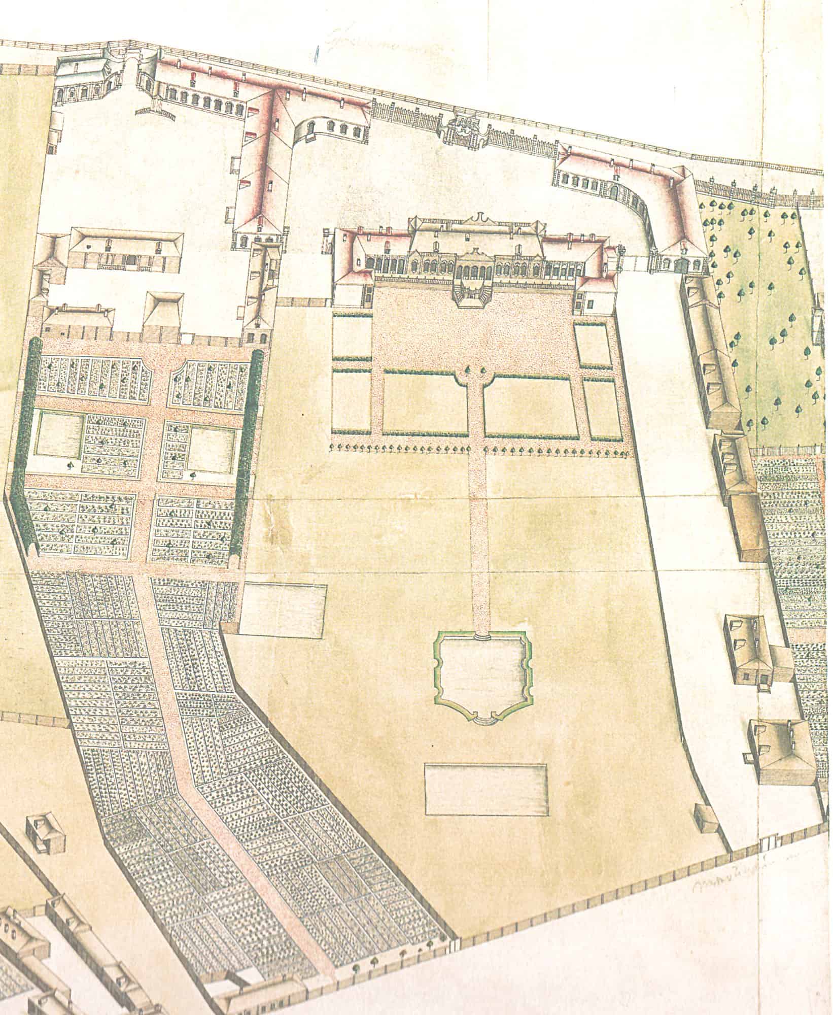
A plan-oblique keeps the plan true to scale and projects buildings and trees upward, so you see their walls and heights without losing the layout. This detail from the axonometric plan of St Petersburg (1765–1773), produced under Pierre de Saint-Hilaire with I. Sokolov, A. Gorikhvostov and others, shows the estate of Lev Naryshkin: palace wings drawn in red, kitchen garden beds in rows, an orchard of tiny upright trees, and a large open ground centred on a single shaped bed.
How to do it: Start from the plan and project vertical elements at a fixed angle, keeping the ground plane flat and light. In SketchUp or Rhino, a steep parallel projection gives the same effect. Our guide to axonometric drawing styles covers the setup in more detail.
Tips for rendering your own landscape plan
- Fix the light direction. In Australia true shadows fall to the south, though many offices use a conventional upper-left light. Pick one and apply it to every tree, wall and building.
- Render by layer. Ground surfaces, then shrubs, trees, shadows and labels, each on its own layer or pass.
- Limit the palette. Three greens, one water colour, one paving colour and a neutral are enough.
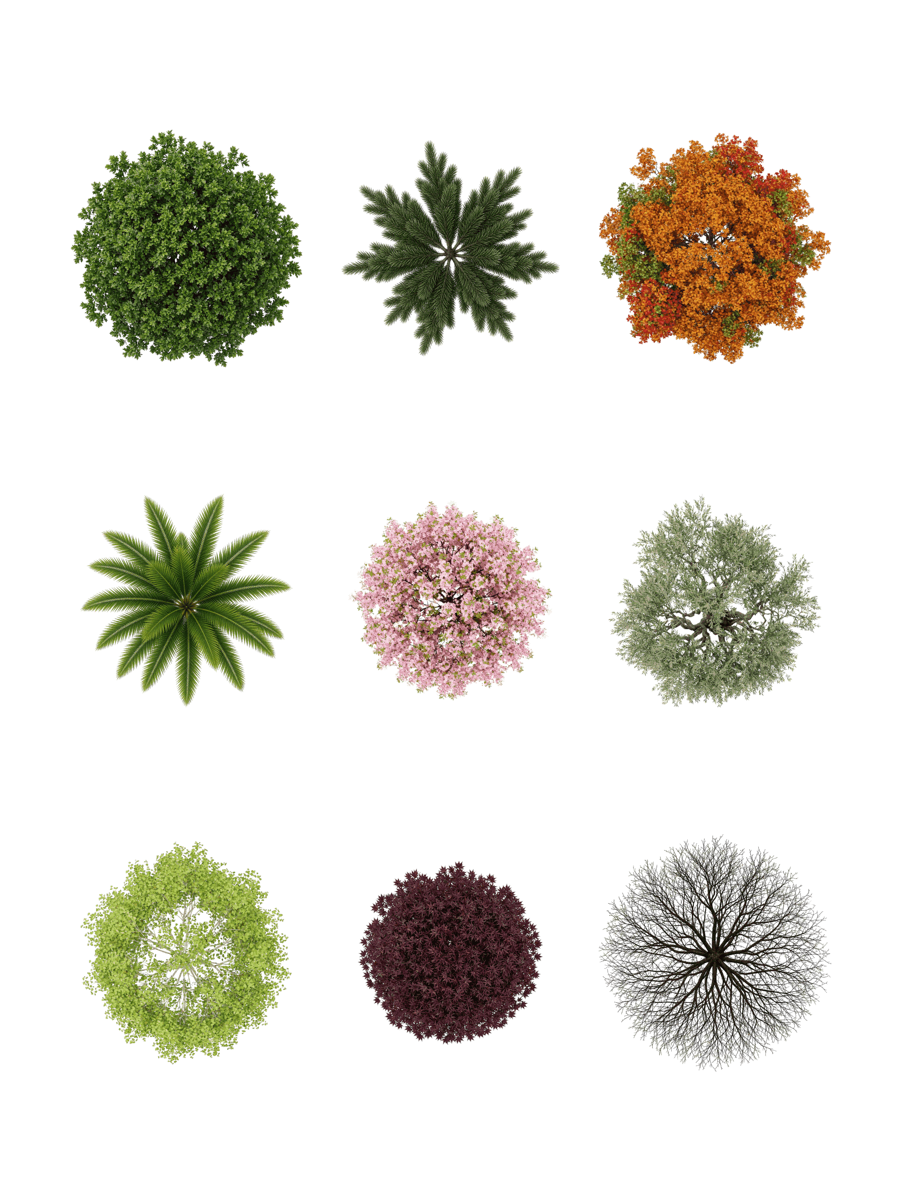
- Use real plant symbols. Plan-view tree cutouts, shrubs and groundcover and autumn trees in plan give quick, consistent symbols. Add top-view people to show scale and use. For matching perspectives, our trees illustration set suits a hand-drawn look.
- Check it in grey. If trees, lawns and paths still separate in greyscale, the values work.
- Lay it out with the other drawings. Our posts on presentation board layouts and architectural rendering styles show how to keep plan, sections and perspectives in one visual language. For the ground textures themselves, see the architectural textures guide. Line weights and hatches from our floor plan graphic styles post carry straight over to landscape plans.
Landscape plan rendering FAQ
What is landscape plan rendering?
It is the process of adding colour, tone, texture and symbols to a landscape or garden plan so that planting, ground surfaces, water and levels read clearly. It can be done by hand (ink, watercolour, marker) or digitally (Photoshop, Illustrator, CAD or GIS).
What software is used for landscape plan rendering?
Most designers draw the base in AutoCAD, Vectorworks or Rhino and render it in Photoshop or Illustrator. QGIS suits large sites; Procreate or scanned hand drawings are common for concepts.
How do you draw trees in a landscape plan?
Draw each tree as a canopy circle at its real or mature spread, with a dot for the trunk. Add a shadow on the side away from the sun, and vary the outline or colour for deciduous, evergreen and feature trees. Overlapping canopies should merge rather than sit on top of each other.
What is the difference between a site plan and a landscape plan?
A site plan shows a building in its setting, with boundaries, access and context. A landscape plan focuses on the outdoor design itself: planting, paving, levels, water and furniture. The two often share a base drawing.



Recent Posts
Landscape Plan Rendering Styles: 15 Examples and Tips
Mid-Century Modern Architecture: History, Key Features and 15 Famous Examples
WAFX 2026 Winners: 27 Future Projects Tackling World Issues