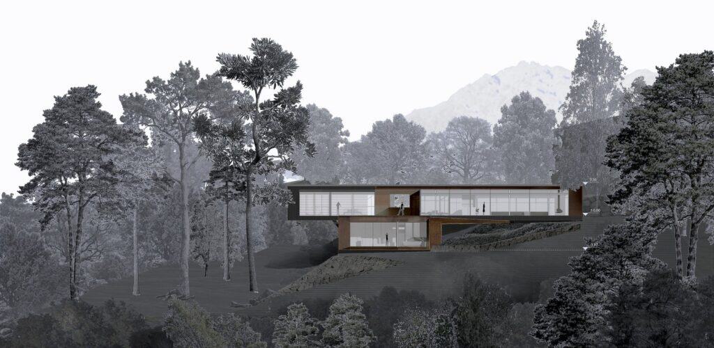
An architectural elevation drawing is the building seen straight on, one face at a time, with no perspective. It shows heights, openings, materials, roof lines and how the building meets the ground, and it is usually the drawing a jury or a client looks at first, because it is the closest thing to what they will actually see from the street. A flat, lifeless one drags down an otherwise strong board.
The quickest fix is often context. A few people, a tree with the right canopy and a believable ground line will do more for an elevation than another hour of rendering, and our free architectural cutouts are made for exactly that. Below are 15 distinct elevation styles, each tied to a published project you can look up, with notes on how to recreate the look. If you are building a full drawing set, this guide sits alongside our posts on architectural section drawing styles, floor plan graphic styles and site plans.
1. The Line-Weight-Only Elevation
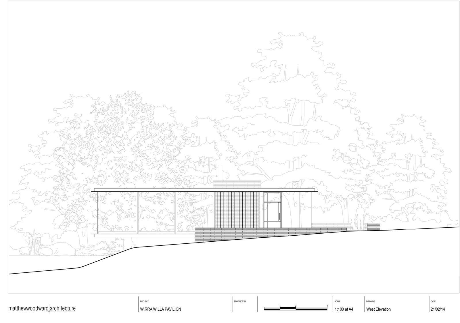
Matthew Woodward Architecture’s west elevation of the Wirra Willa Pavilion, a glass pavilion at Somersby on the NSW Central Coast, is drawn at 1:100 on an A4 sheet with nothing but line. The ground is the heaviest stroke on the page, the pavilion’s frame and stone base sit in a middle weight, and the huge trees behind are traced in a hairline so fine they read like a watermark.
How to recreate it
- Set up four weights and stick to them: 0.70 mm for the ground line, 0.35 mm for the building outline, 0.18 mm for openings and joints, 0.09 mm for trees and texture.
- Trace trees from a photo of the real site as outlines only, and let them run behind the building.
- Keep a proper title block and scale bar; on a minimal sheet, the small type becomes part of the composition.
2. The Shadow-Cast Elevation (Sciagraphy)
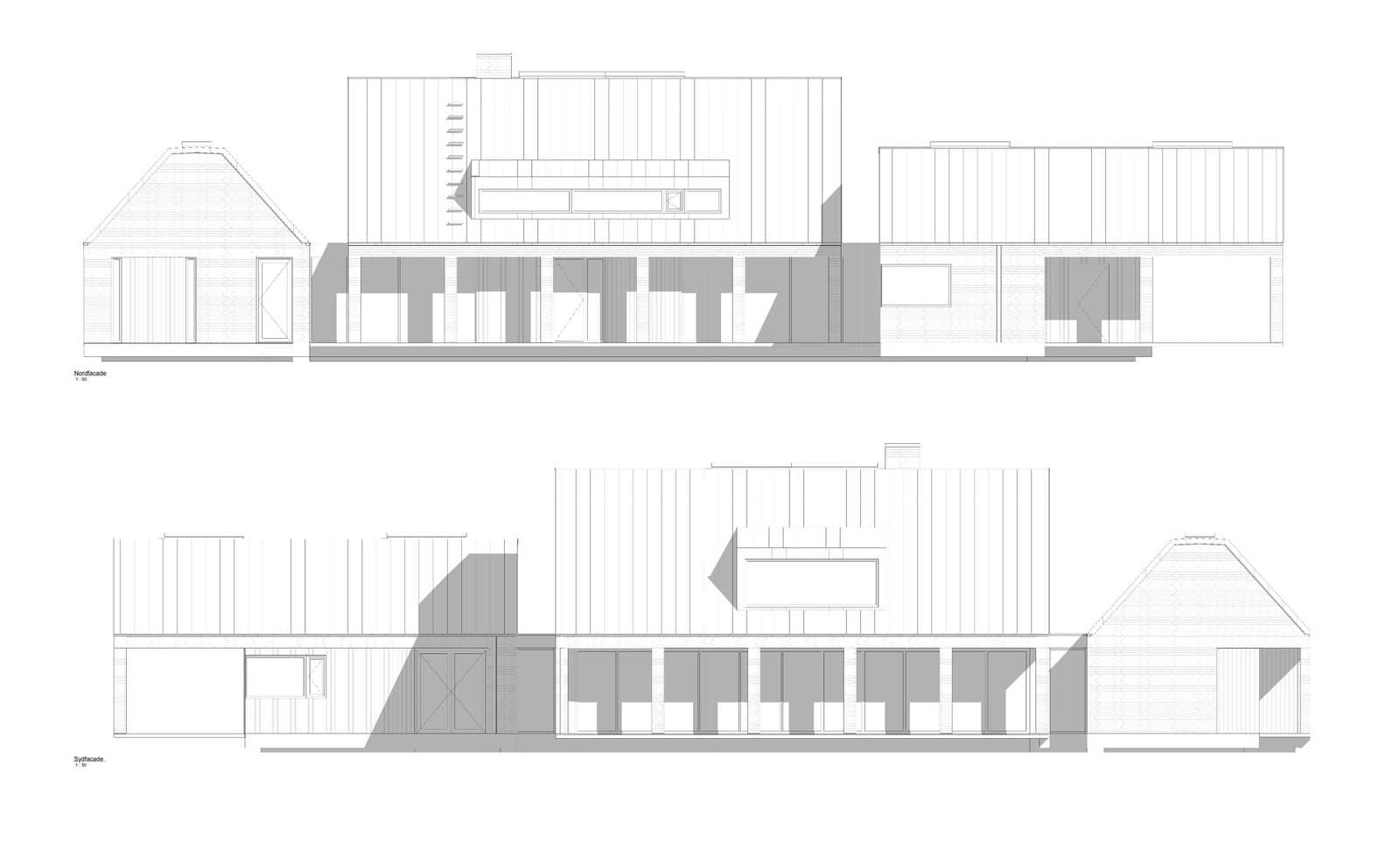
Sciagraphy is the old technique of projecting shadows onto an elevation so that a flat drawing reveals depth. C.F. Møller Architects’ 1:50 north and south elevations of a Villa in Zealand, Denmark, a house rebuilt after the original thatched home burned down, do this with a single flat grey. Shadows fall under the deep eaves, through the colonnade and across the recessed glazing, and you immediately understand which planes step forward and which sit back.
How to recreate it
- Use the classic 45-degree convention: a shadow’s depth on the drawing equals how far the element projects from the wall.
- Draw shadows as one flat, mid-grey fill at around 30 to 40 per cent; no gradients.
- In SketchUp or Revit, switch shadows on in a parallel elevation view, then trace or export the shadow layer separately so you can control its tone. Our guide to shadows in architecture covers why it matters.
3. The Rendered Photoreal Elevation
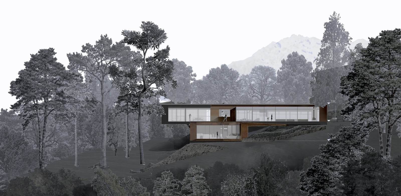
IAPA design’s elevation of the MountainTop Snug Resort, a house completed in 2024 on a forested hillside at Snug, just over 20 minutes’ drive from Hobart, renders the building in Corten and glass and sets it inside a monochrome landscape of tall trees and a distant peak. Only the building carries colour, so even though everything is photographic, your eye goes straight to the architecture.
How to recreate it
- Render an orthographic camera view (V-Ray, Enscape or Twinmotion all offer one) so the elevation stays measurable.
- Desaturate the landscape in Photoshop and leave the building in full colour.
- Layer trees in front of and behind the building to build depth, using consistent, high-resolution PNG cutouts.
4. The Watercolour Elevation
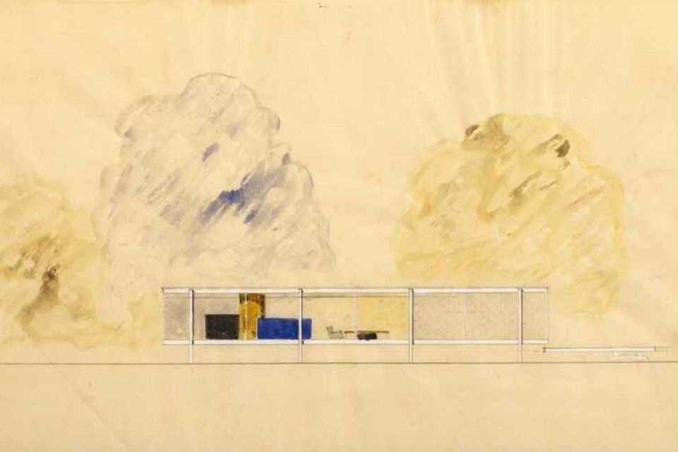
One of the most reproduced elevations of the 20th century is a small watercolour. Ludwig Mies van der Rohe’s 1945 elevation of the Farnsworth House in Plano, Illinois, now in the collection of The Museum of Modern Art, is watercolour and graphite on tracing paper. MoMA attributes the drawing to Edward Duckett, with watercolour later added by Mies. The house is a thin, precise line; the trees behind are loose clouds of blue and ochre. That contrast is the whole lesson.
How to recreate it
- Draw the building in hard pencil (2H) or fine pen first, then paint the landscape loosely around it.
- Limit yourself to two or three colours; Mies used little more than blue, ochre and a few dark accents.
- Work on heavy cold-press paper, or on tracing paper taped flat if you want the same warm, translucent ground.
5. The Hand-Sketched Elevation
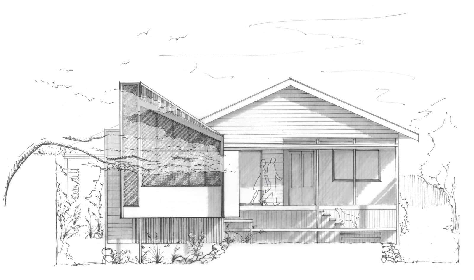
Tim Bennetton Architects’ elevation of Yeronga House, an extension to a Queenslander in Brisbane completed in 2017, is drawn in pencil and fine pen. Weatherboards, the battened sub-floor and the new skillion addition are all there, but so are a couple walking along the verandah, a dog on the steps, birds and a branch reaching across the facade.
How to recreate it
- Print a faint CAD elevation, tape tracing paper over it and sketch freehand on top.
- Hatch shadows with quick parallel strokes rather than shading with the side of the pencil.
- Add one or two moments of life (a figure, a pet, a clothesline) and stop there.
6. The Material and Texture Elevation
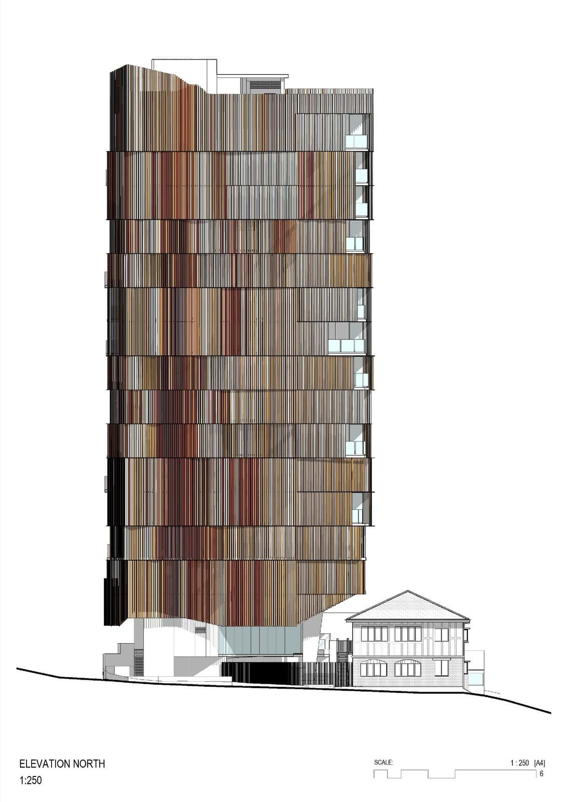
The 1:250 north elevation of Walan, a 14-storey residential building by bureau^proberts at Kangaroo Point in Brisbane, is almost all material. The tower’s vertical screens are drawn as hundreds of thin strips in shifting reds, browns and ochres, while the heritage house beside it at street level stays in plain line. The architects describe Walan as “Queenslanders in the sky”, and the drawing sells that idea of a timber-like, filtered skin without a single render.
How to recreate it
- Build a material palette by sampling colours from real product photos, not by guessing.
- Apply texture as hatch patterns or image fills scaled correctly to the drawing (a 2.4 m board should look like 2.4 m).
- Leave neighbouring buildings in line only so the new facade stands out.
7. The Streetscape Elevation
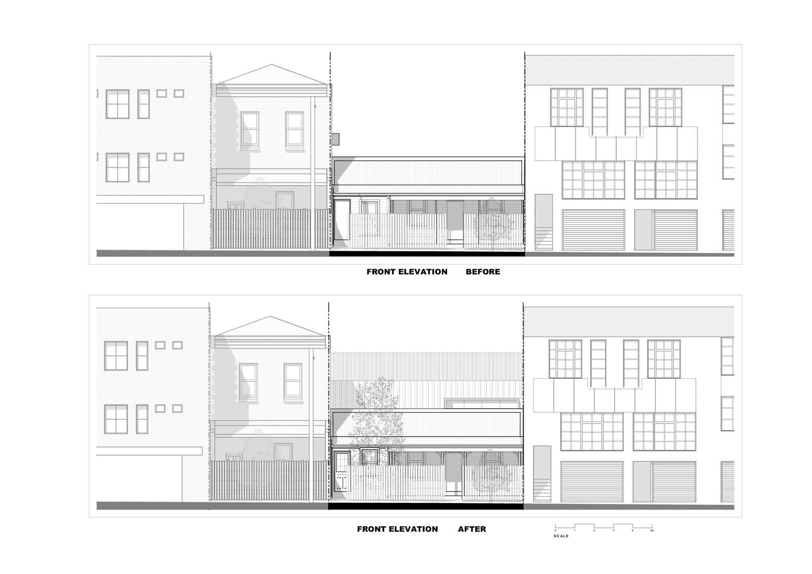
Robert Nichol & Sons’ before-and-after front elevations of Crisp House, the architect’s own renovation of a heritage cottage in Collingwood, Melbourne, are a model of the contextual elevation. The cottage is shown between its neighbours: a two-storey Victorian on one side and a larger building with roller doors on the other. Comparing the two shows how the new upper level sits back behind the original roof line, which is what a heritage planner wants to see.
How to recreate it
- Draw at least one neighbour on each side, from survey or measured photos.
- Put neighbours in a lighter tone or a hatch so your building is the focus.
- Stack “existing” and “proposed” versions at the same scale so the change is obvious at a glance.
8. The Landscape-Framed Elevation
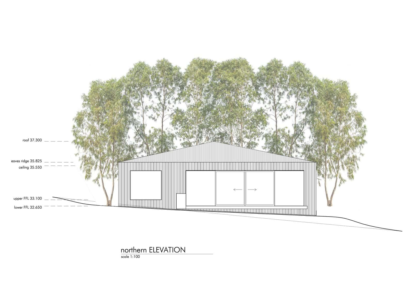
Killora Bay House, a 2021 holiday home overlooking the D’Entrecasteaux Channel in Tasmania by Lara Maeseele and Tanner Architects, sits on a site covered in Tasmanian white gums. Its 1:100 northern elevation is a simple, crisp line drawing of a clad box with a hip roof, framed by a row of photographic eucalypts that rise high above it. The trees are the point: planning conditions protected that canopy, and the drawing makes it the main character.
How to recreate it
- Keep the building in clean line and let realistic tree cutouts carry the colour.
- Use species that actually grow on the site; gums, not palms, on a Tasmanian hillside.
- Add level datums (FFL, ceiling, ridge) down one side; they make an atmospheric drawing feel professional.
9. The Interior Elevation
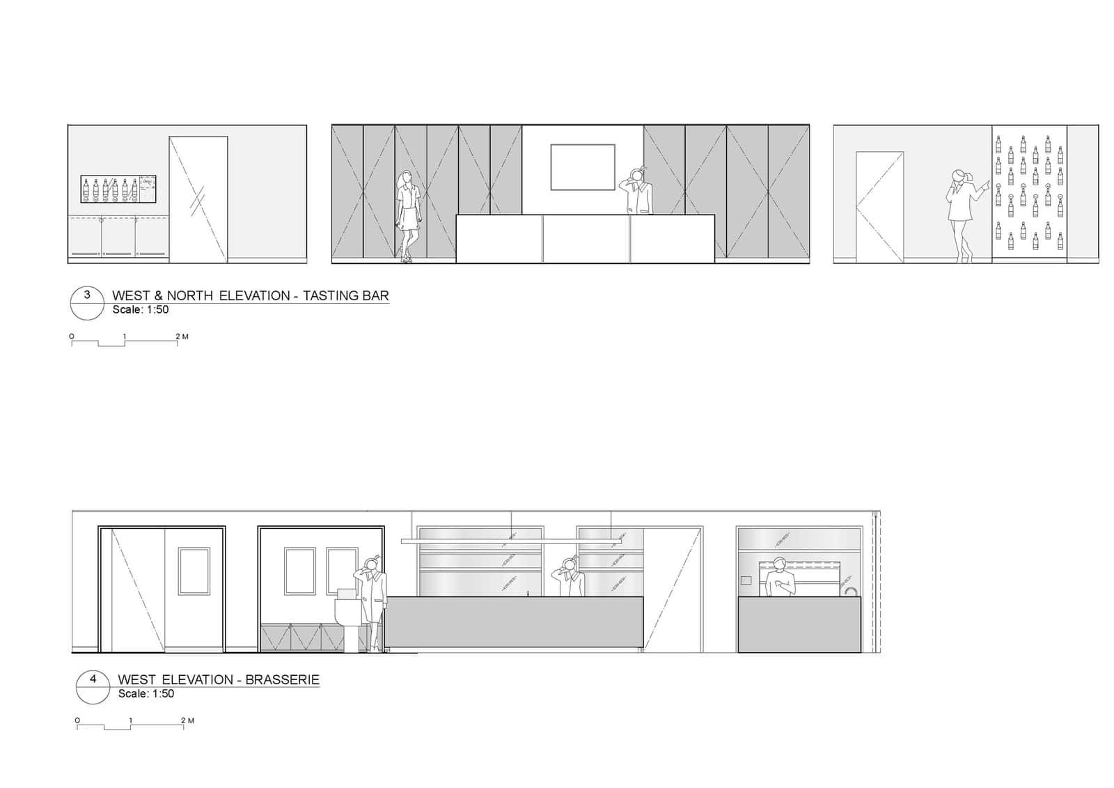
Elevations are not only for the outside. Foolscap Studio’s 1:50 interior elevations for the Chandon Australia cellar door show the tasting bar and brasserie walls flat on, with joinery, panelling, bottle displays and service counters drawn to scale. A few outlined figures give instant scale and show how staff and visitors use each wall.
How to recreate it
- Draw each wall as if you are standing in the room facing it, and key every elevation to the plan with a reference bubble.
- Work at 1:50 or 1:20 so joinery, handles and shelf heights can be read.
- Add simple outline figures; they explain counter and shelf heights better than dimensions alone.
10. The Unfolded (Developed) Elevation
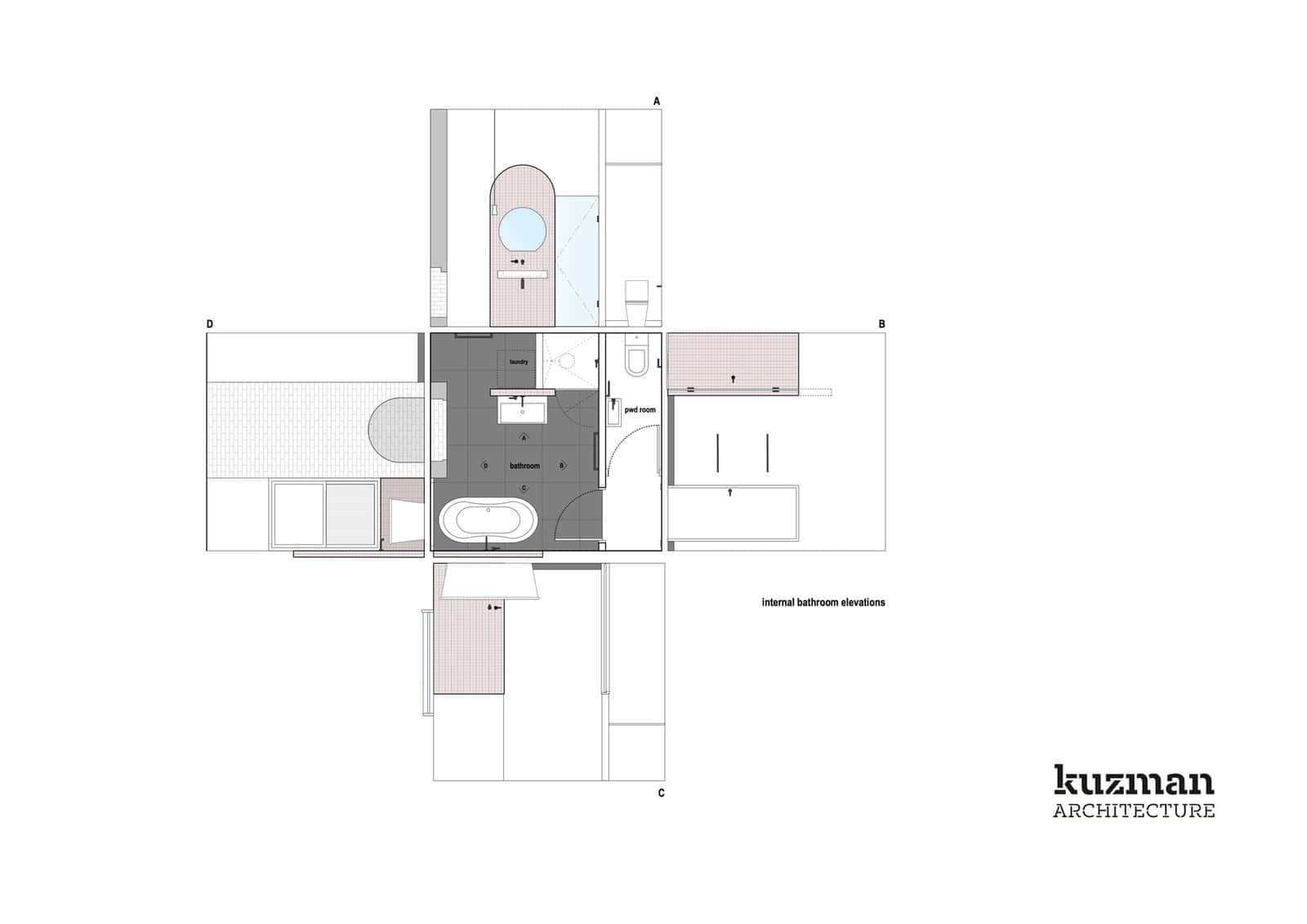
Kuzman Architecture’s internal bathroom elevations for Peek House, a 2021 alteration to a Victorian cottage in Brunswick, Melbourne, place the plan in the centre and fold the four walls out around it, labelled A to D. Arched mirror, shower, bath and powder room fit in one compact diagram. Builders and tilers love it because they never have to flip between sheets.
How to recreate it
- Draw the room plan, then rotate each interior elevation so its base sits on the matching wall line.
- Keep the same scale for plan and elevations (1:20 or 1:25 for wet areas).
- Show tile layouts and set-out points; that is the information the trades will use.
11. The Layered Facade Sequence
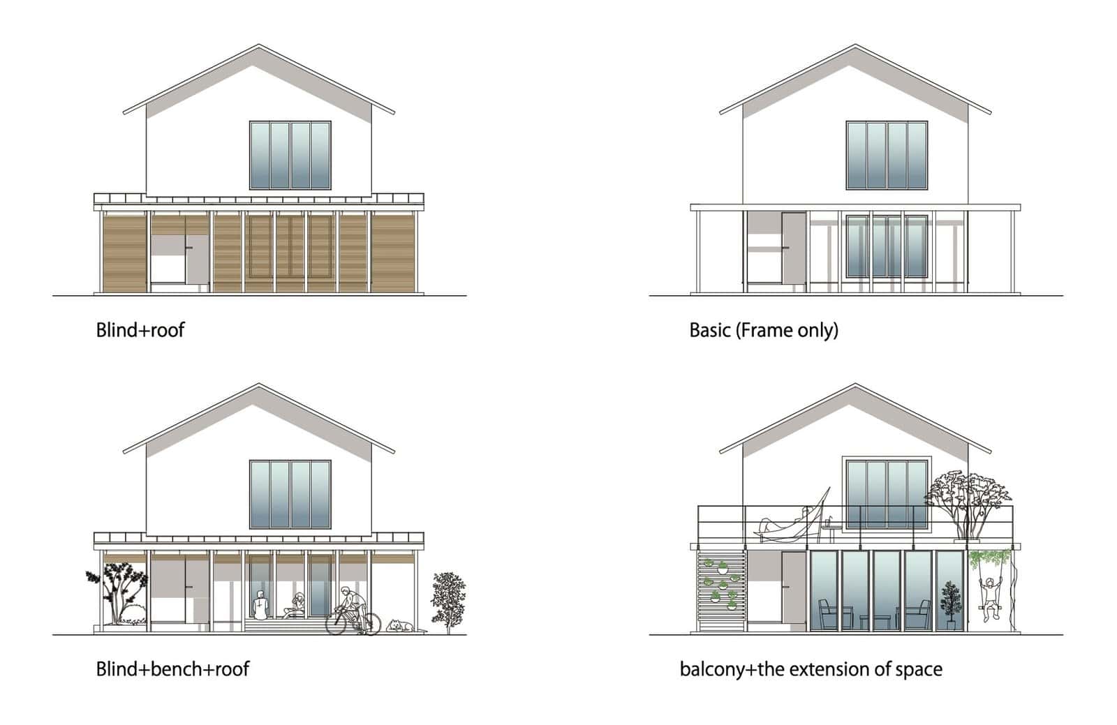
Royal House Co.’s Frame House in Kitakyushu, Japan, completed in 2015, was designed with Japan’s second-hand housing market in mind, as a basic frame that can be added to over time. Its facade pattern drawing shows the same front elevation four times: frame only, then with timber blinds and roof, with a bench, and finally with a balcony and planting. It is a layered, exploded idea told entirely in elevation, with no 3D view needed.
How to recreate it
- Draw one base elevation and duplicate it, adding one layer of the facade (screens, shading, planting) in each copy.
- Arrange the versions in a grid with short captions underneath.
- Use colour only for the layer that changes in each step.
12. The Annotated Construction Elevation
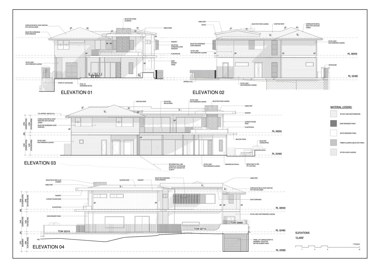
Invilla Architecture’s elevation sheet for Clare House, a 2021 project in Auchenflower, Brisbane, built around a pre-war Queenslander, is a working drawing: four elevations with leader-line notes for every material, RL levels, floor-to-ceiling heights and a material legend. Every note answers a question a builder or certifier would ask.
How to recreate it
- Run horizontal datum lines across all elevations so levels align across the sheet.
- Write material notes in capitals, at one consistent text height, with leaders that never cross.
- Add a material legend keyed to hatch patterns, and keep notes outside the building outline where possible.
13. The Colour-Blocked Graphic Elevation
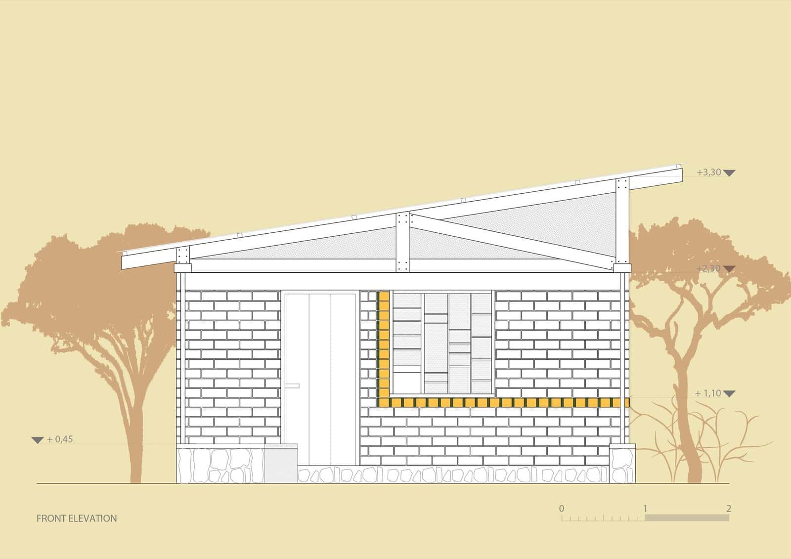
C-re-aid’s front elevation of the Center for Women in a Maasai village in Tanzania, a 25 m² building completed in 2016, sits on a flat sand-coloured background with acacia trees as solid tan silhouettes. The blockwork, stone base and timber roof truss are drawn in white line, and a single strip of yellow picks out a detail around the window. It reads clearly from across a room.
How to recreate it
- Choose a background colour drawn from the site itself (earth, sand, sky) and keep it flat.
- Draw trees and figures as single-colour silhouettes, one tone darker than the background.
- Pick one accent colour for the element you most want noticed.
14. The Night (Inverted) Elevation
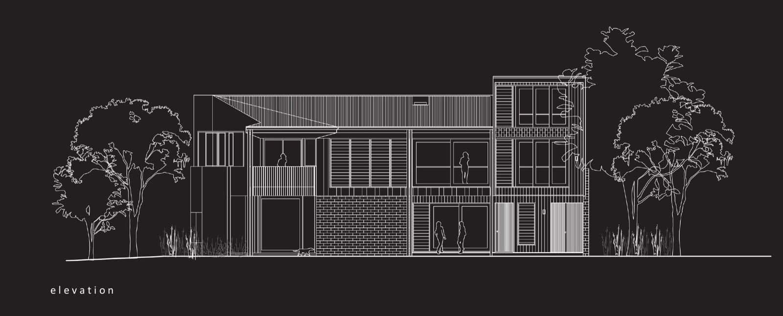
Shaun Lockyer Architects’ elevation of Buena Vista, a 2015 family home on a ridge in Coorparoo, Brisbane, flips the usual drawing: white linework on a black ground. Brick, battens, screens and figures in the windows all read clearly, and the outline gums either side glow like they are lit. Inverting an elevation gives it a night-time mood and makes it stand out on a wall of white boards.
How to recreate it
- Export your linework as vectors, set the background to near-black (not pure black) and invert line colours to white.
- Thicken your thinnest lines slightly; fine white lines on dark backgrounds tend to disappear in print.
- For a true night scene, add warm glow only behind the windows that would actually be lit.
15. The Facade Detail Elevation (Elevation-Section Hybrid)
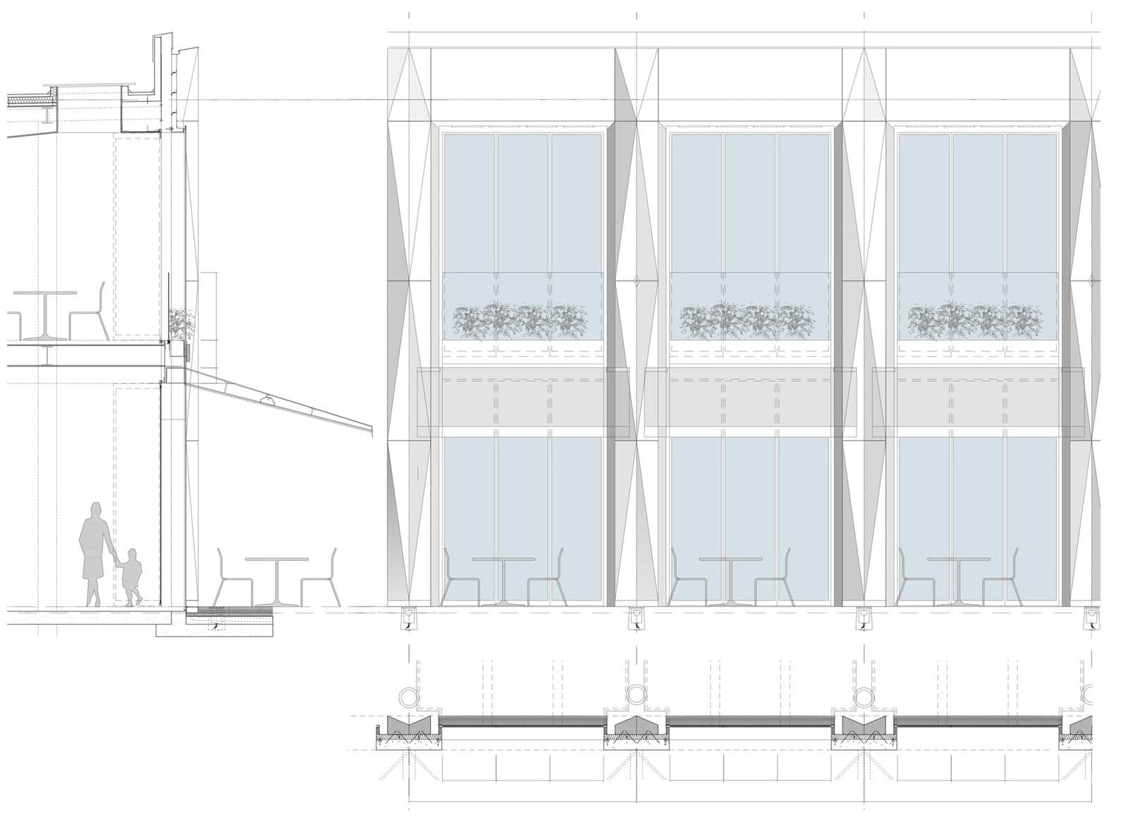
ACME’s shop front elevation for Eastland Town Centre in Ringwood, Melbourne, completed in 2017, sets a bay-by-bay facade elevation next to a section through the same wall, with a plan strip below. You see the faceted pre-cast fins, glazing and planters head-on, then exactly how the canopy, slab edge and wall build-up work at the side.
How to recreate it
- Draw a typical bay (two or three modules is enough) at 1:20 or 1:50.
- Align the section and plan strip to the elevation using shared projection lines.
- Use a light grey tone for the elevation and save the heaviest line weight for the cut parts of the section.
Tips for a Stronger Architectural Elevation Drawing
- Get the ground right. A heavy, accurate ground line (or a solid ground fill) anchors the building. Show the real slope, not a tidy horizontal line.
- Show depth with tone or shadow. Use line weight, a grey tone for recessed planes or cast shadows to show what projects.
- Add scale, but sparingly. Two or three people and a tree or two are enough. Choose figures whose style matches the drawing: outlines for line drawings, photographic cutouts for renders.
- Label orientation. Name elevations by compass direction (north, south) or by street, and keep the labels consistent with the plan.
- Keep the set consistent. Match the line weights, fonts and colours of your plans and sections.
FAQ
What is an elevation drawing in architecture?
An elevation is an orthographic drawing of one side of a building, viewed straight on as if from infinitely far away. It shows height, openings, materials, roof form and the ground line, with no perspective, so everything can be measured to scale.
What is the difference between a section and an elevation?
A section cuts through the building to show the inside: walls, floors, rooms and structure. An elevation shows the outside surface of one face without cutting anything. Interior elevations are the exception: they show one inside wall of a room, still without cutting through it.
What scale should an elevation be drawn at?
Building elevations are usually drawn at 1:100 for houses and 1:200 for larger buildings, with 1:50 for more detail. Facade details are drawn at 1:20 and interior joinery elevations at 1:20 or 1:25. Always include a scale bar so the drawing still works when printed at a different size.
How many elevations does a building need?
A typical set has four, one for each main face, named by orientation (north, south, east, west). Irregular buildings need more, and planning applications often ask for a streetscape elevation too.
What should be included on an elevation drawing?
At minimum: the ground line, building outline, openings, roof form, materials, finished floor levels and overall heights, plus a title, orientation and scale. Construction elevations add material notes, RL levels and dimensions.
Conclusion
A good architectural elevation drawing tells the viewer what the building is made of, how it meets the ground and what it will feel like to walk up to. Start with clean line weights and an honest ground line, then borrow one technique from the examples above (cast shadows, a watercolour sky, a black background) and test it on your next board.
Recent Posts
Architectural Elevation Drawing: 15 Styles and Examples
Architectural Section Drawing: 14 Styles to Inspire You
Romanesque Architecture Explained: Arches, Mass, and Monastic Power