Why Floor Plan Graphic Styles Matter
Have you ever looked at a floor plan and felt instantly engaged — or completely lost? That difference often comes down to floor plan graphic styles. While the architecture and layout are critical, the way a floor plan is visually presented can completely change how it’s understood. From the textures and line weights to the color schemes and annotations, graphic styling plays a powerful role in how ideas are communicated.
In architecture and design, first impressions matter. Whether you’re pitching a concept to a client, submitting an assignment, or presenting a portfolio piece, the visual language of your floor plan speaks before you do. This article explores 15 stunning examples of floor plan graphic styles to inspire and inform. We’ll break down how each one works, what makes it effective, and how its layout contributes to a polished presentation. Use these examples to refine your own style, sharpen your communication, and elevate your next design project.
1. Soft Pastel Floor Plan Graphic Style
Palatte:
Cool Purple: #A5A8CC
Magnolia: #EDEDF9
Pale Dogwood: #FAD6C4
This floor plan graphic style uses a soft pastel palette to communicate spatial organization with a calming, approachable aesthetic. The cool-toned purples and warm blush accents create a subtle contrast that makes individual rooms and furniture layouts easy to distinguish without overwhelming the eye. This style works particularly well for residential projects where mood and ambiance play a key role in presentation.
From a layout perspective, the plan is cleanly framed with clearly defined edges and a consistent line weight throughout. The surrounding landscape is lightly rendered to provide context without competing for attention. As a floor plan graphic style, this approach strikes a balance between clarity and visual softness — ideal for portfolios, client presentations, or mood-sensitive projects.
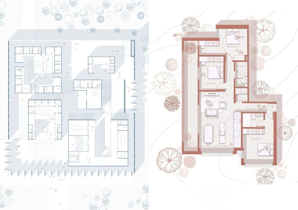
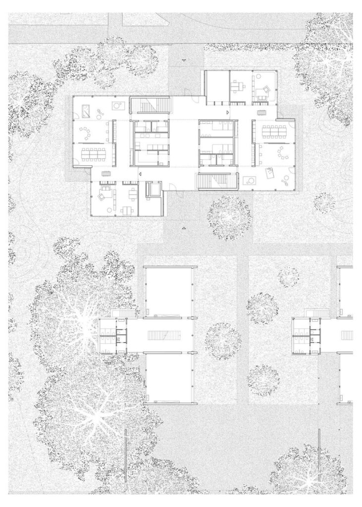
2. Clean Lineweight + Topographic Floor Plan Graphic Style
Palatte:
Glaucous: #5A7FAB
Payne’s gray: #556375
Ghost white: #F9FAFE
This floor plan graphic style blends precise linework with soft contextual topography in the background, creating a clean yet dynamic visual. The use of thick outer wall lines contrasted with fine interior detailing helps to establish visual hierarchy, guiding the viewer through the layout without clutter. This approach is ideal for communicating function with technical clarity while still offering visual sophistication.
What sets this example apart is the integration of abstract site context using topographic curves and transparent landscape circles. These soft overlays add depth and environment without overwhelming the architectural plan itself. As a floor plan graphic style, it strikes an excellent balance between presentation polish and technical readability — perfect for competitions, client briefs, or academic portfolios.
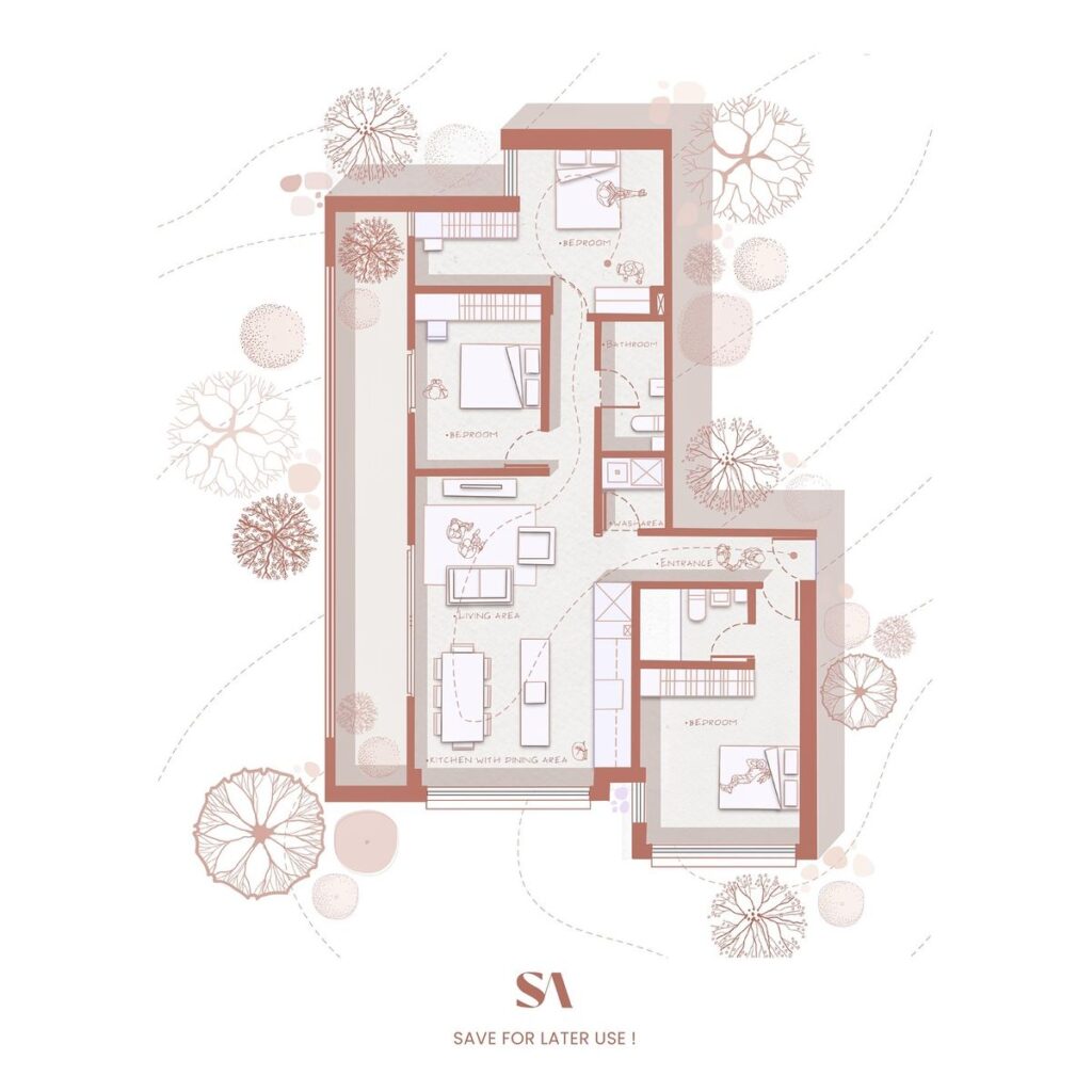
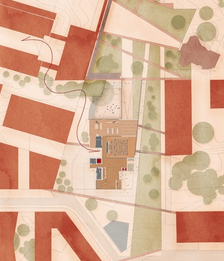
3. Delicate Tonal Floor Plan Graphic Style
Palatte:
Old rose: #CC8678
Platinum: #D3DDDF
Snow: #FDF9F6
This floor plan graphic style uses soft earth-toned hues paired with finely drawn tree canopies and light topography to create a warm, immersive presentation. The red-toned walls contrast beautifully against the muted beige background, allowing the plan to stand out while still feeling integrated with its natural context. Shadows and textures are minimal, giving the entire composition an elegant, quiet clarity.
What distinguishes this as a floor plan graphic style is its combination of precise architectural representation with hand-drawn environmental detailing. The inclusion of vegetation and site lines adds just enough context without overpowering the architectural content. It’s an ideal approach for landscape-sensitive projects or presentations aiming to evoke a peaceful, human-scale environment.
4. Monochrome Linework Floor Plan Graphic Style
Palatte:
Black: #000000
Silver: #CECECE
Anti-flash white: #EFEFEF
This floor plan graphic style relies entirely on fine black-and-white linework, offering maximum clarity with no color distractions. The precision of the drawing communicates both spatial layout and material texture through variations in hatch density and pattern. It’s a classic architectural style that prioritizes legibility and professional readability above all else.
What makes this example stand out is the meticulous rendering of context — particularly the trees and ground textures — using just stippling and line density. The consistency in line weight across the plan maintains a strong graphic identity, making this an ideal style for academic submissions, construction documentation, or minimalist portfolios. As a floor plan graphic style, it’s simple, timeless, and extremely effective.
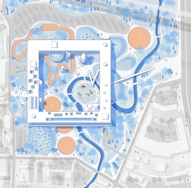
5. High-Contrast Diagrammatic Floor Plan Graphic Style
Palatte:
Peach: #EEBD9B
UN Blue: #5292D5
Jordy Blue: #91BBE2
Timberwolf: #D1D1CE
This floor plan graphic style takes a bold diagrammatic approach, combining clean architectural lines with vivid accent colors — in this case, bright blue and orange — to highlight program zones, landscape features, and circulation paths. The style balances abstraction with clarity, turning the floor plan into an engaging visual map that communicates function and form simultaneously.
The layout emphasizes layered detail, from the expressive site contours to subtle textures and miniature figures for scale. This example of floor plan graphic style is especially effective in competitions or presentations where storytelling, hierarchy, and instant visual impact are key. It’s ideal for large-scale public or institutional projects where design concepts need to be understood quickly and memorably.
6. Soft Monochrome Floor Plan Graphic Style
Palatte:
Terracotta: #BA776C
Isabelline: #F2EFED
White: #FFFFFF
This floor plan graphic style uses a limited, dusty rose color palette to bring warmth and unity to the entire composition. The consistent tone ties the architectural elements, furniture, and vegetation together while keeping visual clutter to a minimum. The result is a clean, emotionally appealing plan that feels both modern and user-friendly.
The layout is enhanced by simple line illustrations of human figures and furnishings, which help demonstrate spatial use without being distracting. The fine detailing in trees and soft dotted movement lines give the plan a hand-drawn quality, making this style especially effective for residential projects or portfolios aimed at communicating comfort, elegance, and clarity.
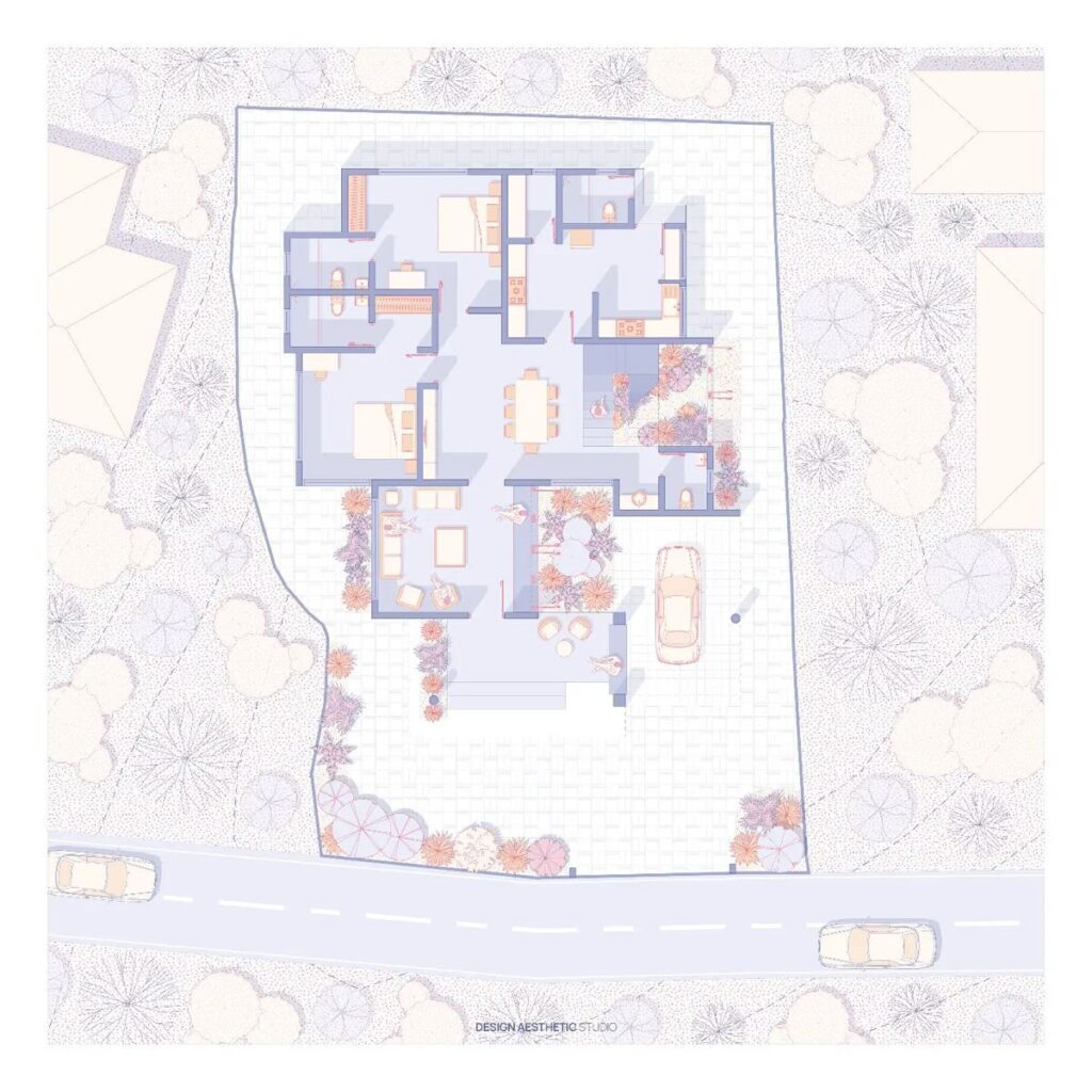
7. Patterned Background Floor Plan Graphic Style
Palatte:
Red Sugar: #B36850
Sage: #C5C5AD
Cream: #FCF8F5
This floor plan graphic style leans into rich detail, combining line-drawn furniture, textural fills, and a repeating patterned background that gives the plan a distinctive, almost editorial feel. The muted green and terracotta palette helps unify the architecture and surrounding landscaping, while the consistent line weights maintain legibility across the drawing.
What makes this style especially unique is its integration of surface textures — both within the interior spaces and the landscape context. The patterned backdrop not only adds depth but also frames the house within its environment in a way that’s visually balanced and engaging. As a floor plan graphic style, it’s particularly effective for storytelling, branding, or themed presentation boards.
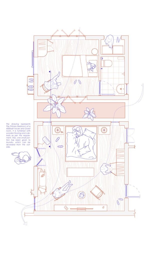
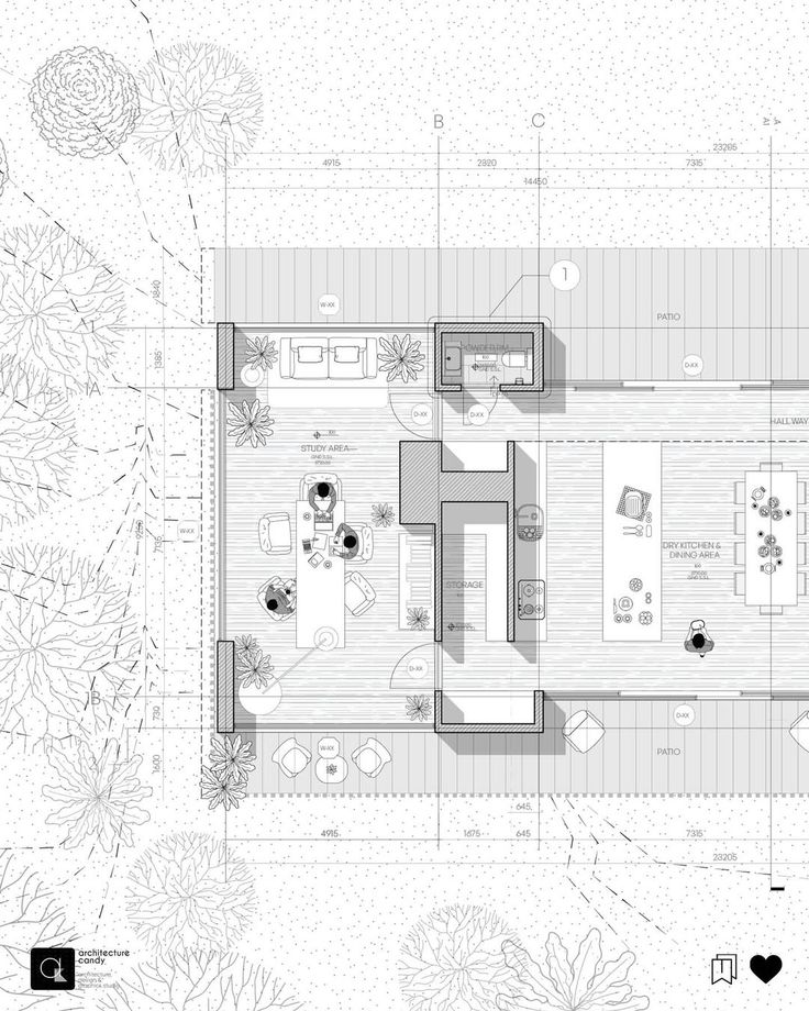
8. Human-Centered Line Drawing
Palatte:
Tropical indigo: #9884E4
Tea rose (red): #D7AFAB
Misty rose: #F6DFD9
This floor plan stands out for its thoughtful use of clean linework paired with delicate figural illustrations. Rather than focusing solely on walls and furnishings, the graphic emphasizes human interaction within the space. Figures are subtly integrated into the composition, showing people seated, sleeping, walking, or engaged in everyday tasks. These movements are underscored by soft motion trails and annotations, which help narrate how the room is experienced, not just structured. It’s a style that invites empathy and imagination, immediately helping the viewer connect emotionally to the space.
Visually, the dual-tone palette — a balance of soft blue and muted terracotta — offers both contrast and clarity without overwhelming the drawing. There’s a restrained but strategic use of textures, such as wood grain on the flooring, which provides a tactile sense of material without making the plan feel busy. Altogether, it’s an expressive and storytelling-driven format, perfect for designers seeking to convey more than just layout — but also atmosphere, comfort, and lived-in dynamics.
9. Soft Shadow Illumination Floor Plan Graphic Style
Palatte:
Rose Taupe: #805651
Pink: #E2ADAB
Ash Blue: #BFCFCF
This floor plan graphic style maintains a purely flat, orthographic viewpoint while introducing a sense of spatial depth through directional shadows. There’s no axonometric tilt or 3D distortion — instead, light and shade are used to softly highlight wall thicknesses, fixtures, and furnishings. These shadows fall consistently in one direction, grounding the drawing and adding a gentle dimensionality that feels both intentional and atmospheric.
The palette uses desaturated reds and subtle greys to define structure and hierarchy, while background textures and circular landscaping motifs offer just enough visual softness. This style works especially well for layouts intended for display — whether in portfolios, exhibitions, or design presentations — where clarity, mood, and precision all need to coexist in balance.
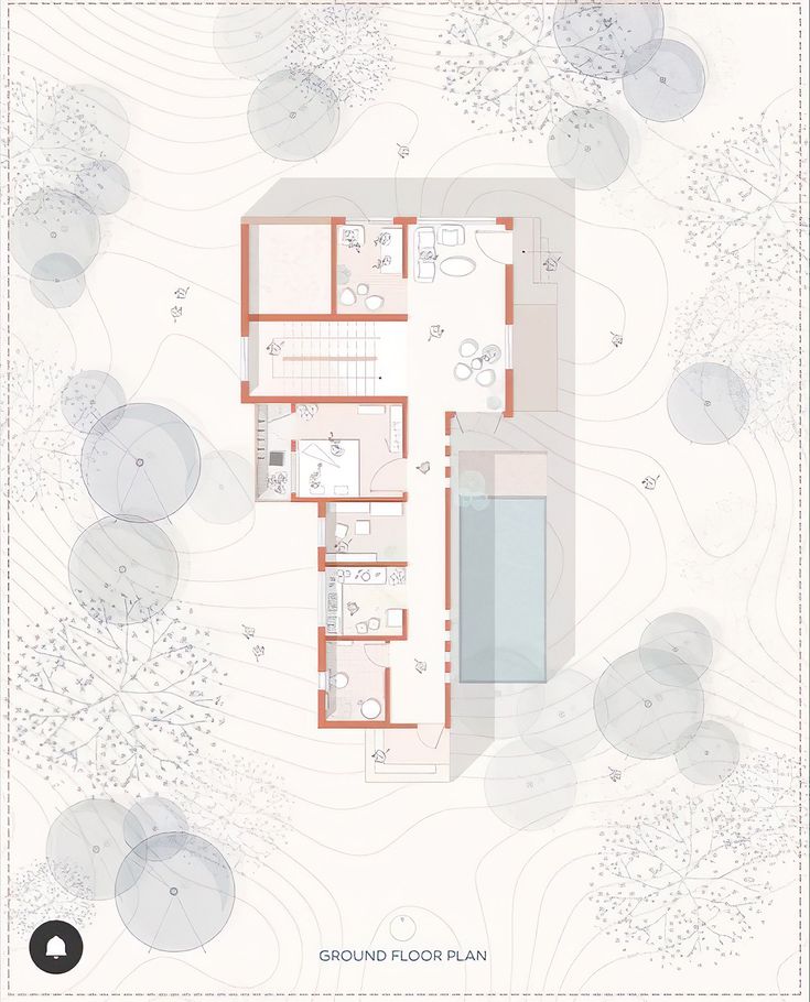
10. Red Monochrome Garden Floor Plan Graphic Style
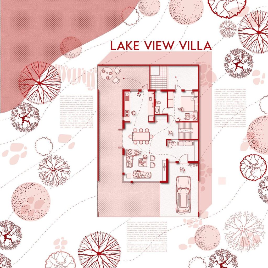
Palatte:
Cornell Red: #B61316
Misty Rose: #F5D8D4
White: #FFFFFF
This floor plan graphic style wraps the architecture in a bold, red monochrome — a striking visual strategy that captures immediate attention without sacrificing clarity. The drawing avoids gradients and shading, relying instead on sharp line weights, solid fills, and clean detailing. Furniture and textures are rendered in a simple, illustrative way, giving the layout a polished, almost editorial feel.
What elevates this graphic, though, is the surrounding context. Stylised tree canopies, dotted textures, and directional paths frame the villa like a piece of graphic design. It’s more than just a floor plan; it’s a full visual narrative. This approach is perfect for design competitions or conceptual proposals, where storytelling and atmosphere carry just as much weight as the architectural layout.
11. Serrated Shadow Frame Floor Plan Graphic Style
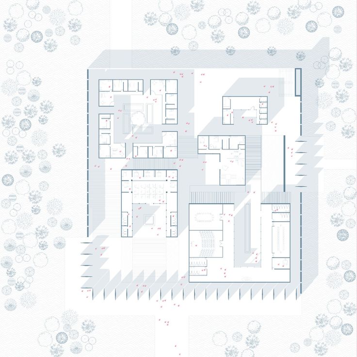
Palatte:
Cadet Gray: #90A3AE
Anti-flash white: #E5EAEE
Lilac: #CB9DB2
This floor plan graphic style takes a precise, minimalist approach but introduces drama through deep, serrated shadows. The linework is light and clean, allowing the negative space to breathe and emphasizing the architectural layout with clarity. At first glance, it feels technical, but then the angled shadows pull the eye outward, adding movement and visual hierarchy.
The use of light blue and white tones with punctuated red annotations gives it a cool, refined quality. It feels almost surgical in how it presents information, yet those exaggerated directional shadows — especially at the periphery — create a bold edge. This style is ideal for institutional or cultural projects where you want the plan to feel structured but still carry a strong visual identity.
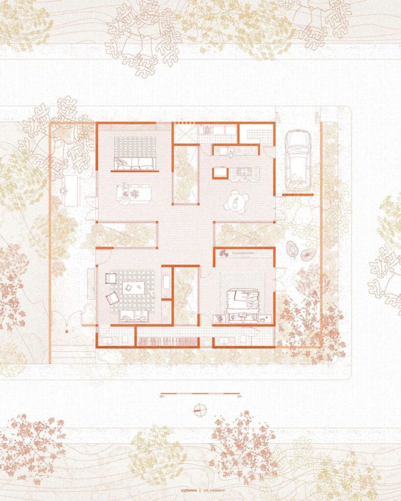
12. Earth-Toned Collage Mapping – Floor Plan Graphic Style
This floor plan graphic style leans heavily into a collage aesthetic, blending architectural representation with an almost tactile, hand-crafted feel. Dominated by earth tones—terracotta, dusty greens, and ochres—it evokes a strong sense of place and materiality. The layers of context are abstracted into overlapping cutouts that resemble textured paper or fabric, creating a rich, multi-dimensional composition.
What sets this apart is how the site is treated not just as background but as part of the narrative. The surrounding blocks, vegetation, and pathways are represented in the same graphic language as the building itself, reinforcing integration with the landscape. This style is particularly effective for conceptual presentations or academic work where you want to convey atmosphere, texture, and story—not just function.
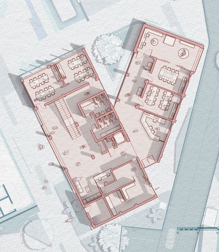
13. Technical Monochrome Drafting Floor Plan Graphic Style
This floor plan graphic style brings clarity through precision. It mimics the sharp, clean conventions of architectural working drawings but enhances them with graphic richness. Monochrome tones dominate, but the variety of line weights, fills, and subtle hatchings introduces depth and hierarchy without the need for color. You get an instant understanding of material changes, zones, and function.
Where this style shines is its ability to bridge technical communication and presentation value. Though rooted in traditional CAD output, the addition of stylized entourage—plants, furniture, and people—infuses life and readability into what could otherwise be a sterile drawing. It’s a go-to for portfolios and professional presentations where detail matters as much as aesthetics.
14. Warm Gradient Wash Floor Plan Graphic Style
Palatte:
Persian Orange: #D58D6C
Peach: #EDBA96
Dutch Light Green: #DDD1A7
This floor plan graphic style radiates warmth, almost like a soft autumn afternoon rendered on paper. A carefully curated gradient wash—using subdued reds, browns, and golds—sweeps across the drawing, giving a hand-illustrated, almost nostalgic vibe. Instead of relying on harsh outlines, it uses gentle transitions between elements to build contrast and atmosphere.
The technique blends digital precision with the softness of analogue textures. Foliage is treated as delicate linework, echoing ink pen sketches, while interiors pop through light saturation and smart layering. It’s a style often seen in academic portfolios or design competition entries—where conveying emotion is as important as spatial logic. Viewers linger here not just to understand, but to feel.
15. Beyond Floor Plans – Graphic Style Consistency Across Drawings
Palatte:
Apricot: #FCC2AA
Coral pink: #D79481
Light coral red: #DC7B82
Polynesian blue: #2B4E9A
White: #FFFFFF
While this image isn’t technically a floor plan, it powerfully demonstrates a core principle of architectural representation: consistency. The same visual language used in a plan—color palette, line weight, shadow strategy, entourage style—can and should flow into your other drawings. In this isometric perspective, the red and blush tones echo the same hue family we saw in previous plans, while the stylized trees and figures maintain that whimsical yet precise aesthetic.
When your presentation drawings share a unified graphic style, they stop functioning as isolated images. Instead, they form a cohesive narrative. This consistency builds clarity, brand identity, and professional polish. Whether it’s a plan, section, elevation, or axonometric, letting your graphic style thread through the set transforms the way your audience reads your work—seamlessly and with confidence.
Why Floor Plan Graphic Style Matters More Than Ever
In a world overflowing with architectural visuals, your graphic style is your fingerprint. It’s the difference between being scrolled past and being remembered. As we’ve seen across these 15 unique examples, floor plan graphic styles are no longer just technical necessities—they’re storytelling tools. Each style carries emotion, hierarchy, atmosphere, and intention. It’s not just about how a space functions, but how it feels, even in 2D.
Whether you’re aiming for a clean monochrome aesthetic or a richly textured pastel look, the real power lies in intentionality. When your floor plans are considered as part of your broader visual identity—from sections to perspectives to isometric views—your work becomes more than drawings. It becomes a design experience.
So, as you build your next portfolio, pitch, or project submission, think carefully:
What does your floor plan graphic style say about you?
Recent Posts
15 Floor Plan Graphic Styles That Will Elevate Your Presentation Game
The Role of Shadows in Architectural Storytelling
When Furniture Becomes Architecture: Blurring the Line